Microsite landing pages are built using the landing page editor. This article walks you through the editor and your options.
For information about customizing and configuring the microsite, read Create a microsite.
Navigate to the landing page editor
You must navigate to your microsite to access the landing page editor.
- Select Content Activation, and then select Standard Experiences. Finally, select Microsite Builder.
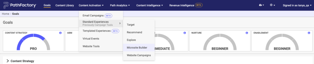
Microsite Builder menu item - Select the microsite you wish to edit.
- On the screen that appears, select the Landing Pages tab.
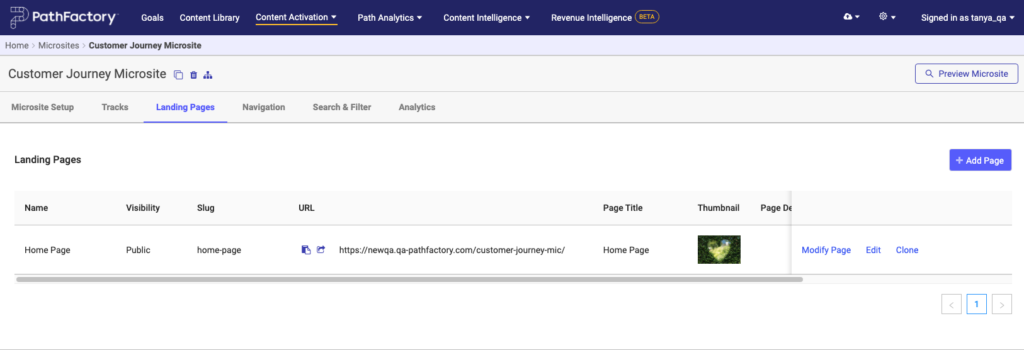
Microsite Landing page tab - Beside the landing page you wish to edit, click its corresponding link Modify Page.
Landing page editor
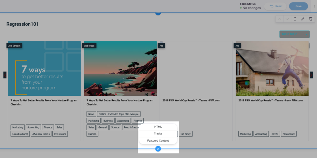
The landing page editor allows you to add and modify page content in blocks. To add a block, click anywhere on the landing page and then click on the + sign. The + turns into an X. Now you’ll see three content block options: HTML, Tracks, and Featured Content. These are each explained below.
HTML
HTML inserts a fully customizable block of HTML. You can use this to add your own copy, images, links, etc. to the page. When you add an HTML block to the page you’ll see a new block that defaults to the text “This is a paragraph…”. When you select the block you’ll notice options to move the block up or down (upward and downward arrow icon), edit the block (pencil icon), and remove the block (trash can icon).
When you select edit (the pencil icon) you’ll be presented with several options in a dialog.
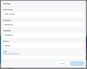
- HTML Content – This option allows you to edit the HTML content of the block
- Background – Allows you to define the background color or a background image for the block. This is often used for hero banners.
- Typography – Allows you to define the default text settings for the block
- Spacing – Allows you to control how much padding is added around the block.
- Class– Allows you to add a custom HTML class to the block which you could then target with external code (such as Javascript or CSS) to modify further.
Tracks
The Tracks block allows you to add a content track’s assets as tiles within a block on the page.
Note: all content assets within the content track will be added as tiles within this block. If you wish to only show a subset of the content assets as tiles in the block see the following information on featured content blocks.
When Tracks is selected you’ll see a new block with the default text “Please select a Track”. As with the HTML block described above, the arrow icons allow you to reposition the block relative to other blocks, the edit (pencil) icon allows you to edit the block content, and the trash icon deletes the block from the landing page.
When you select the edit (pencil) icon you’ll be presented with a configuration dialog where you can choose several options for how a content track is presented.
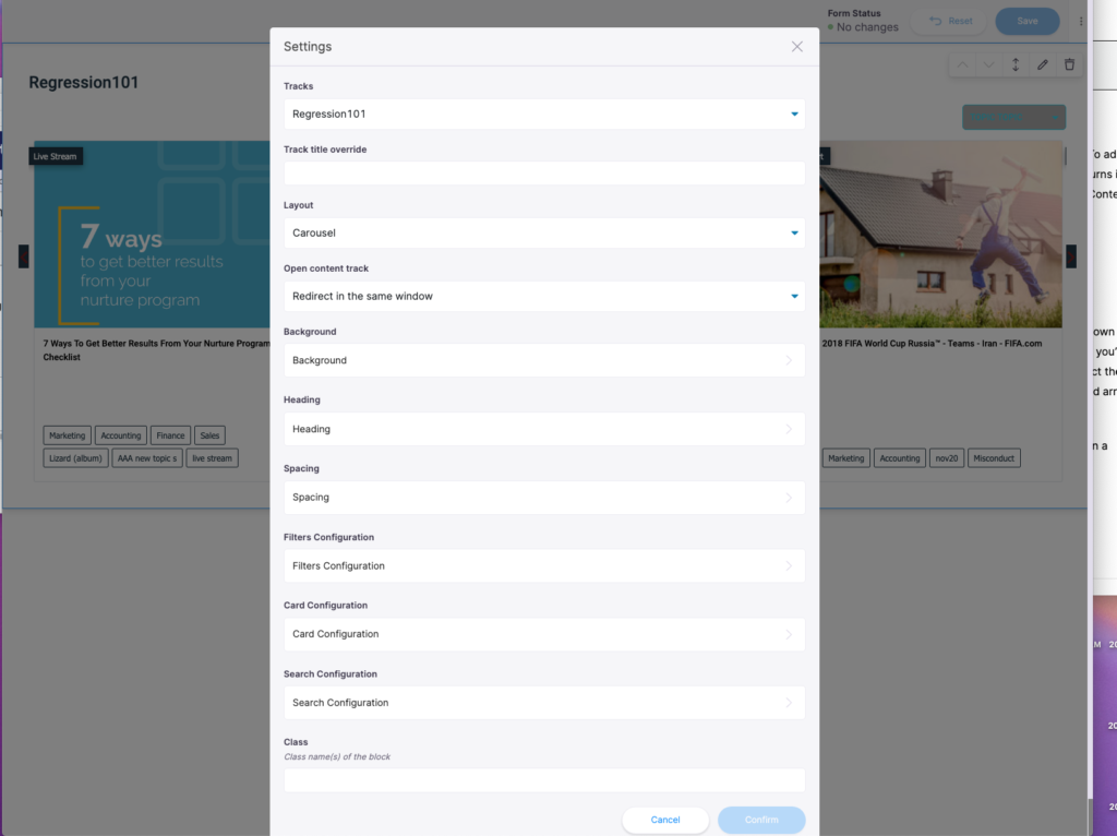
- Tracks – Presents a dropdown menu with all of the content tracks you’ve added to the microsite. To make additional content tracks available refer to “Tracks” Tab above.
- Track title override – By default the heading of the block will be the content track name, however this text field allows you to override the Title.
- Layout – Choose either grid or carousel layout for all the assets from the content track.
- Open content track – Choose the site behavior you want when a visitor selects one of the assets in the track. Your options include redirect in the same window, overlay in the same window, or new tab.
- Background – Allows you to define the background color or a background image for the block.
- Heading – Allows you to control the color and alignment of the block’s heading.
- Spacing – Allows you to control how much padding is added around the block.
- Filters Configuration – Allows you to enable any available tag as a filter, and to define the color and label for that filter.
- Card Configuration – Allows you to style and control the text used below the card for each asset.
- Search Configuration – Allows you to enable a search box for the block. Note: This functionality only allows visitors to search within that particular block for content. You can also style the text and background color of the search box.
Select a Track and when you are satisfied with your settings, click Confirm.
All of the thumbnail images populate from the Content Library, so if there is one you’d like to change you can do so there. When a visitor to the landing page selects a tile, they’re taken to the content track itself, where the existing form strategy still applies. The appearance of the track however will inherit the appearance that has been set at the Microsite level to ensure that branding is consistent.
Featured Content
The Featured Content block allows you to produce tiles of only a subset of the content within a content track. You can even mix featured content from multiple content tracks into the same featured content block. When you select Featured Content as a new block, you’ll see a new Featured Content Block.
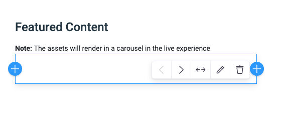
Within this block the same options in the top right corner hold true as with other blocks. The arrows allow you to reposition the block, the edit (pencil) icon allows you to edit block settings, and the trash icon deletes the block from the landing page. Selecting the edit (pencil) icon opens a dialog with several options.
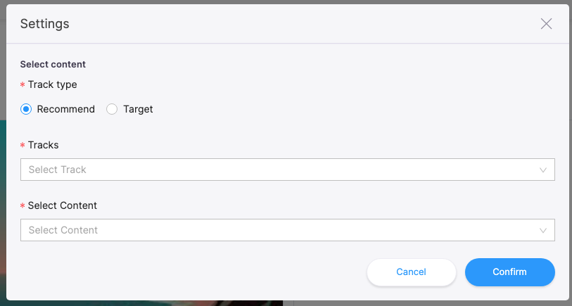
- Recommend or Target – select the type of track you want to add here.
- Tracks – select the track you want to add.
- Select Content – select the content within the track you want to add.
To pin specific content assets to the featured content block, look for the + icon within the block itself. You likely have to select the block to make the + icon appear.
After selecting the +, a sub-block with its own options appears. The arrow allows you to reposition the featured content relative to other featured content assets within that block, the pencil allows you to choose which content asset should be featured, and the trash icon allows you to delete the featured content asset from the block. The + icons on either side of the sub-block allow you to add additional content assets on either side of the existing content asset.
Select the edit (pencil) icon. A dialog appears from which you can choose a content track and the specific content assets to feature.
To add additional content assets as featured within the block, select the + to add a new sub-block for the new featured asset, then repeat the previous instructions.
Note: If you attempt to select a content track and see “No Data”, ensure first that the content track has been added to the microsite (read the article Create a microsite). Secondly, ensure you’ve toggled correctly to Recommend or Target before attempting to find the content track.
Views: 138