Summary
The colors, fonts, imagery, and layout of your Explore Page can be customized in Appearances (located in the Settings menu, which you can view by clicking the gear icon). This article covers how to set up an appearance group for your Explore pages.
|
Note
|
For more information on using appearance settings for Target and Recommend Tracks, see this article. |
Important Things to Note:
- Make sure you select the correct Appearance group when adjusting the Explore page appearance settings.
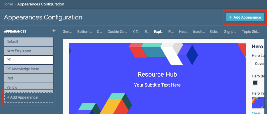
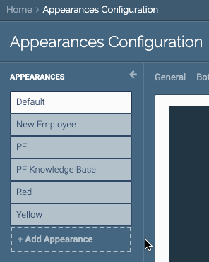 Example of adding an Appearance
- You can create a new appearance group or clone an existing appearance group by clicking Add Appearance
 Add Appearance menu button
Navigate to Appearances
- Click the gear icon at the top right of the page. Select Appearances from the drop-down menu.
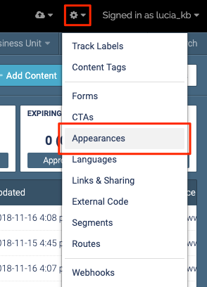 Appearances menu item
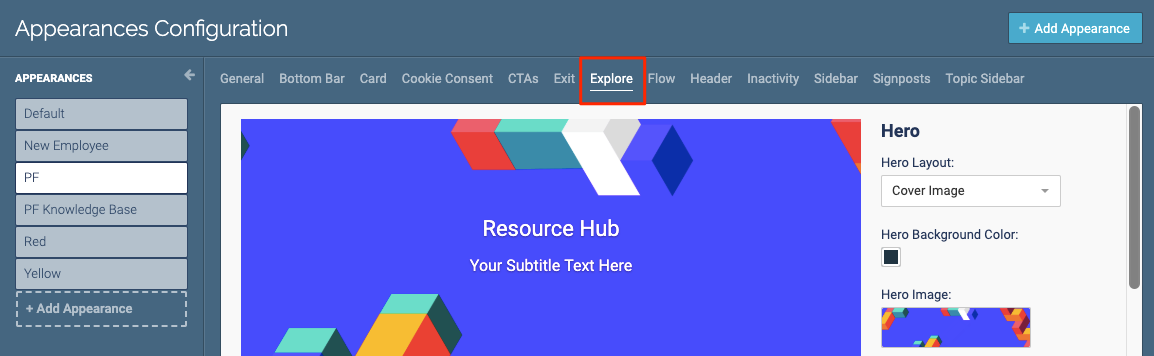
 - Select the appearance group you want to edit, or create a new appearance group.
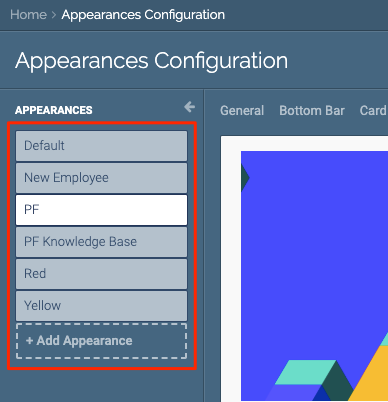 Appearance group
Note
Appearance group
NoteYou can also clone an existing appearance group.
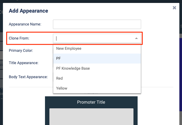 Clone Appearance dropdown list
 - Select the Explore tab.
 Explore tab as seen in the main menu
Hero Appearances
The Hero section is the top of your Explore Page.
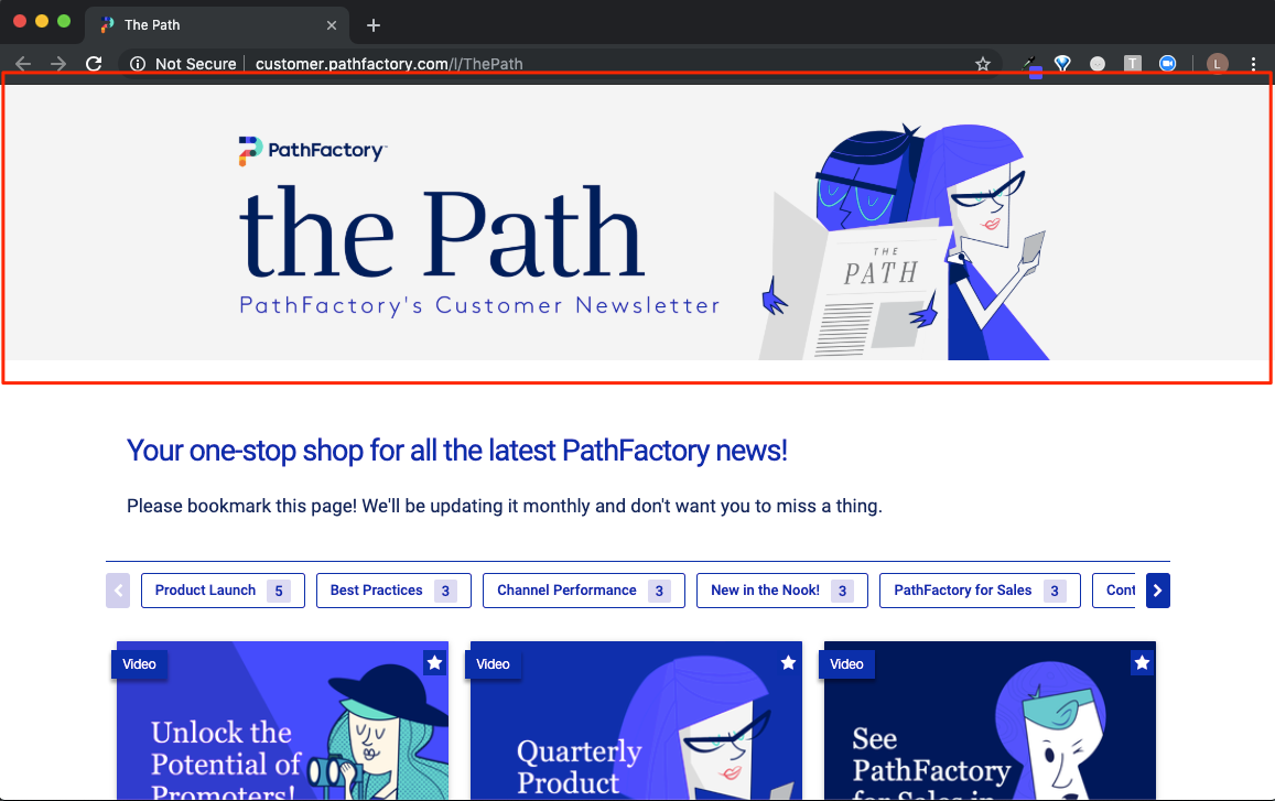 Example of a Hero section
|
Warning
|
Remember to regularly save your changes by clicking Save Explore Settings at the bottom of the Explore tab.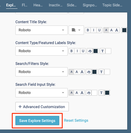 Save Explore Settings button Save Explore Settings button |
- Select the layout for your Hero section:
- Cover Image: Just the hero banner, with no logos
- Branded: Hero banner with a logo
- Partnership: Hero banner with two logos
- Personalized: Hero banner with two logos and one headshot
|
Note
|
Check out these Explore Use Cases for examples of what these layouts look like in action! |
- Click the color box to select a background color for the hero section.
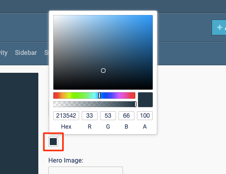 Color box for selecting a background color
 - Click Hero Image to select a background image for the hero section.
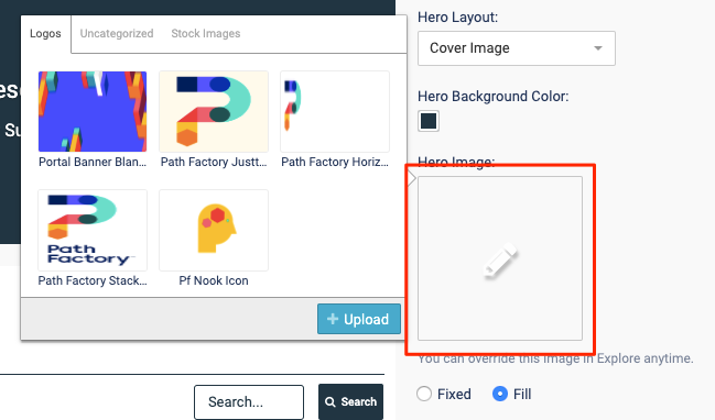 Hero background image example
 - Click Upload to add a new image, or select one of your existing images. Click Save.
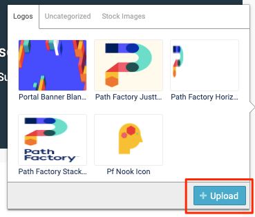 Upload button
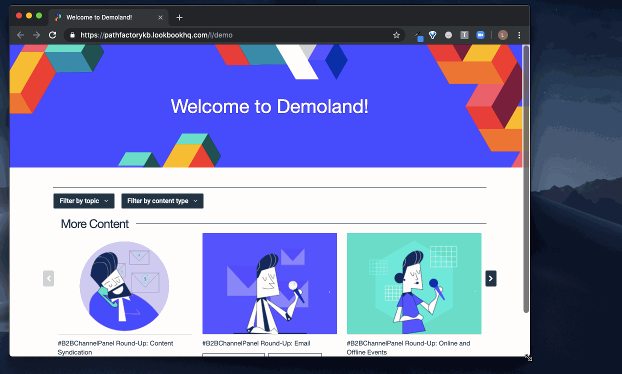
 - Select either Fixed or Fill for your hero image.
Fixed: Ensures that the same portion of the background image will always be shown.
Use this setting if your hero image has text or other styling which shouldn’t be cut off.
 Example of a Hero image fixed
Fill: Responsive to the size of the window, ensuring that the background image always fills the Hero section. The background color will never show.
Example of a Hero image filled Image of the Fixed and Fill radio buttons
 - If you select Branded, Partnership, or Personalized: Click each logo to upload and select an image.
 Example of logos to upload
 - Select the font settings for your Hero Title and Subtitle.
Note
If you want to use a font which isn’t listed, you can contact support to have the font added to your PathFactory instance.  Image of Hero title and subtitle dropdown lists
Body Appearances
The body of your Explore page is where all of your content assets are displayed.
|
Warning
|
Remember to regularly save your changes by clicking Save Explore Settings at the bottom of the Explore tab.Save Explore Settings button |
- Select the layout for your content assets.
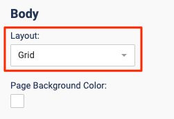 Layout dropdown list
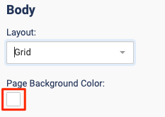
- Click the color box to select a background color.
 Layout dropdown list – grid
 - Set the text settings for your Explore page’s Title and Description.
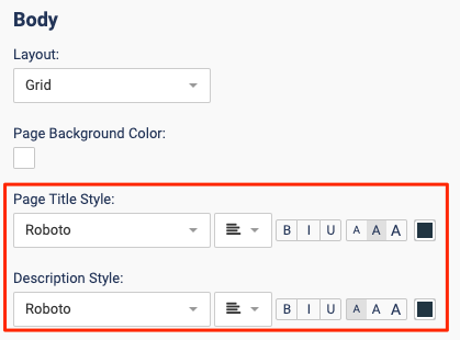 Text settings dropdown lists
 - Set the font settings for the content asset labels.
Note
Content titles (the names of the content assets) will always be displayed. When setting up your Explore page, you can choose whether or not the Content Type and Featured labels will be displayed. 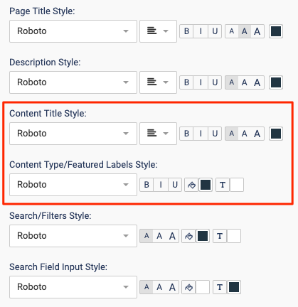 Content styles dropdown lists
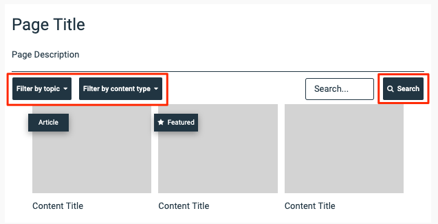
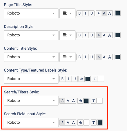
 - Select the font settings for the search and filter functions.
Things to note:
- The search button and the filters will have the same styling
 Search bar and filters for the Explore page
 - When setting up your Explore page, you can choose whether or not the search bar and filters will be displayed.
 Search and filter style dropdown lists
 - The search button and the filters will have the same styling
Advanced Customization
The Advanced Customization feature allows you to add scripts to the header, body, or footer of your Explore Page.
|
Warning
|
We strongly recommend working with your web team to ensure the code you use is complete. For example, if your website is hosted on a CMS (eg. Drupal) you must ensure the code is exportable. |
Example:
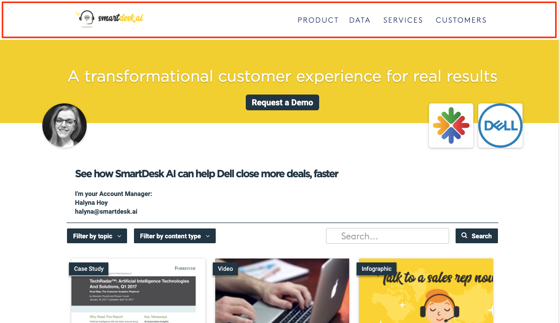
Use Advanced Customization to add your company’s website header to an Explore page, ensuring consistent branding.
 Example of advanced customization
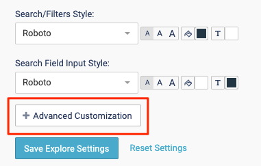
- Click Advanced Customization.
 Advanced customization button
 - Enter your code in the appropriate sections. Click Save.
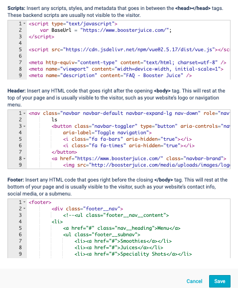 Example of html code
Views: 179