Layout Settings allow you to configure the appearance and behavior of a Explore page, including the following features:
- CTAs
- Header
- Hero section
- Featured Content
- Topic Carousel
- Search Function
- Filters
- Advanced Customization
CTAs
Add CTA buttons to encourage your visitors to perform an action, such as requesting a demo, talking to sales, or accessing more information.
|
Note
|
CTA buttons will only be available if you have already created them in your PathFactory instance. Read more at Use CTA Buttons. |
- Open an Explore Page and toggle on CTAs.

Explore Page CTA toggle - Select the location for the CTA: Hero, Body, or Footer. Click on one of the locations and then fill in the CTA attributes (color, destination, etc).

Explore Page CTA Location NoteYou can add multiple CTAs to a single Explore Page, but no more than one in each location. - on the same menu, in the dropdown list provided, select the CTA you want to use. To save the new CTA, click Update. To leave without saving, click Cancel.
Note
If you add a Hero CTA, the Hero section must be toggled on in order for the CTA to appear.
Header
Add a header to a content track to have the track’s title and description displayed on every content asset. The header will be displayed on the Explore Page as well as on assets inside the content track.
Highlighted in the screen capture below is an example of a Header displayed.

|
Note
|
If you want to change the styling of the header or add a logo to it, you may do so in Explore Appearances. |
- Click Header to switch the toggle to On.

Explore Header toggle - To change the page title, click the No Overrides link below the Header toggle.
- Type in the new header title in the field provided. To save the new title, click Save Header Customization.

Header Customization menu
Hero
The hero section appears at the top of a Explore Page, and can be used to display a title, description, and background image or color.
|
Note
|
Change the styling of the Hero section in Appearances. You are able to customize the Hero’s layout, background color, image, fill behavior, logos, fonts, and text colors. |
- Click Hero to switch the toggle On.

Explore Hero Customization - If you want to display text in the Hero section, make sure Show Text is toggled On.
- Select the title and/or description text boxes on the Explore Page to add or edit text. Remember to Save your changes.

Explore Edit Options - You can change the set Hero image by clicking Image Customization.
Note
The Hero image is tied to the appearance group, but you can override this image.
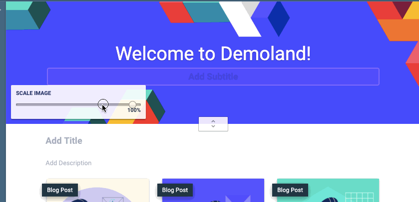
Tips for Styling the Hero Section
- You are able to set a default Hero image for each Appearance group you’ve created
- The recommended Hero image width is 1600 px
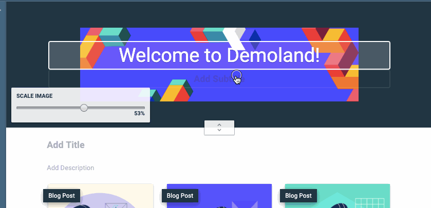
- Use the scale to change the size of the hero image (if this option doesn’t appear, you need to change the Explore Appearance settings from “Fill” to “Fixed”)
Scale an image - Click and drag the image to move it
Move an image - Click the Center Justified icon to re-center the Hero image (if this option doesn’t appear, you need to change the Explore Appearance settings from “Fill” to “Fixed”)
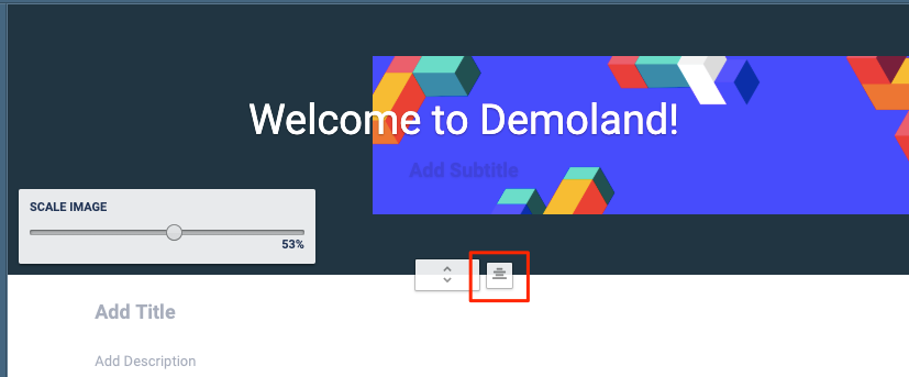
Center justified image
Click here for more information on styling an Explore Page.
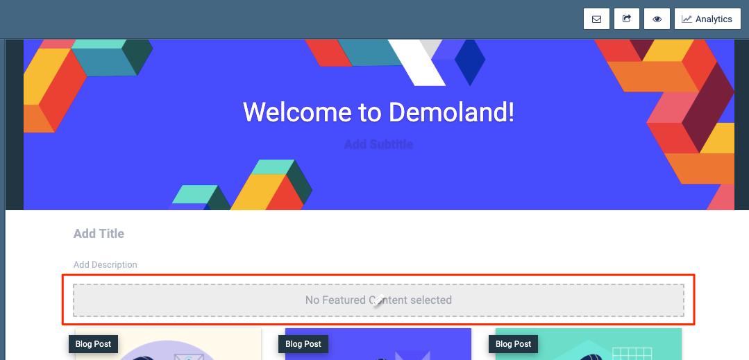
Featured Content
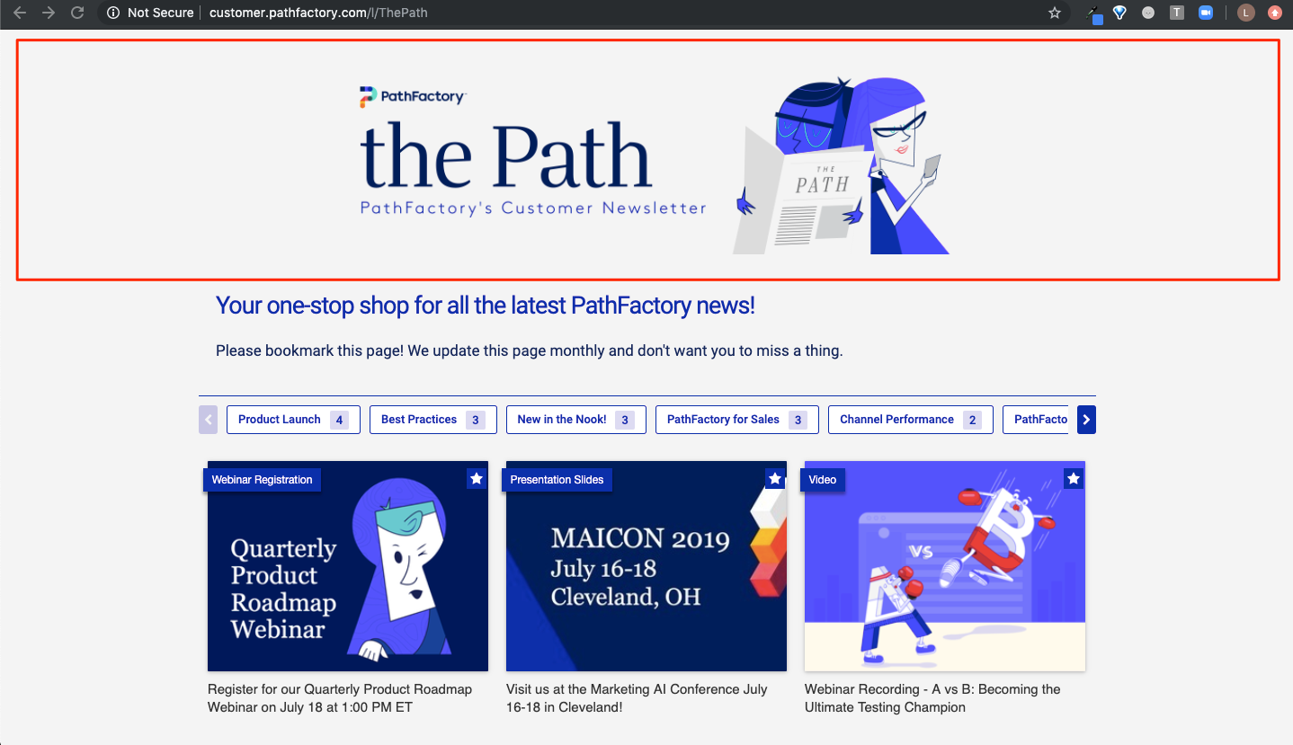
The Featured Content section allows you to select up to 3 specific content assets to display at the top of the Explore Page.
|
Note
|
Configure the font and colors of the Featured Content label in Appearances. |
- Click Featured Content to toggle On this function.

Explore Featured Content toggle - On the Explore Page, click the box that says No Featured Content Selected.
Featured content field - Following the prompts, select up to 3 assets to feature.
Note
You are only able to select content assets that are in the Explore Page’s base Content Experience. 
Explore Manage Featured Content menu - After you have selected the content assets, you can drag and drop the content assets to change their order, or click the trash icon to remove a content asset.
- To lock in your changes, click Save Assets. The content assets are now displayed on the Explore Page. To leave without saving, click Cancel.

Explore Featured Content
Topic Carousel
If you selected topic carousel (instead of Grid) when setting up Appearance settings, you can configure which topics are used when you set up the rest of the layout settings.
|
Note
|
Configure the colors of the topic carousel arrows in Appearances. |
- To add a Topic Carousel, on the Explore Page click Add Topic Carousel as shown in the example below.

Add Topic Carousel - The following menu appears, for you to enter the topics you want to display in the carousel, and in what order. You can also enter what text you want to display for visitors to click to find more content.

Manage Topic Carousels menu - Once you’ve entered the topics, you can drag and drop them to rearrange their order.
Note
Read this article for more information on Topic Carousels. - To save your changes, click Save Topic Carousels. To exit without saving, click Cancel.
Search Function
Add the Search Function to help your visitors find the content that they’re interested in.
- To activate this feature for an Explore Page, toggle on Search Function. You’ll see a search field and Search button appear on the Explore Page.

Explore Search Function NoteTo change the styling of the Search Bar in Appearances. You are able to customize the font, text color, and background color for both the search button and search bar.
Filters
Adding filters helps your visitors narrow down the available content according to their interests. Content assets can be filtered by topic and/or content type.
|
Note
|
Change the styling of the Filters in Appearances. You are able to customize the font, text color, and background color. |
- Click Filters to switch the toggle to On.

Explore Filters - From the list of Filters below the toggle, select the filters you want to display above the content carousel.
NoteThe numbers listed next to each topic represent the number of content assets in the given track which have that topic tag.
These numbers appear for visitors when using the filter.
Views: 171