This article describes how to build a Template for a Content Page or Landing Page that is based on a Theme. Content Page Templates and Landing Page Templates must be created in order to build a Content Page or Landing Page within a Templated Experience.
Note: We have updated our WYSIWYG editing menus to include new options such as Undo, Redo, and Clear All Formatting. As a result, whenever you are editing live Content Pages and Landing Pages that were composed using the previous text editing menus, ensure you carefully preview the changes of the appearance of text and layouts before you save them.
What Are Content Pages and Landing Pages?
Content Pages are equivalent to Content Playlists, which contain curated and branded collections of content that bring together assets and call-to-action buttons in a focused digital experience. You can link to these Content Pages from any link or CTA in any channel (website page, social post, ad banner, etc.). For PathFactory customers familiar with Content Tracks, Content Pages and Content Playlists are very similar to Content Tracks in look and feel.
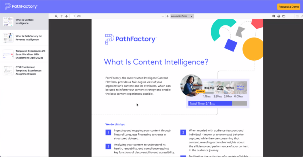
Before you can build a Templated Experience Content Page, you must first set up Content Page Templates. These templates incorporate heading elements set within the Theme, as well as different layout options to choose from to display your content. Below is an example of a completed Content Page.
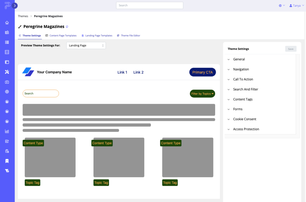
Landing Pages are website-like digital experiences that you can create within Templated Experiences. Landing Pages are highly customizable and can support a wide variety of use cases — e.g., a campaign hub, product support site, ABM experience, a partner resource center, event marketing, just to name a few.
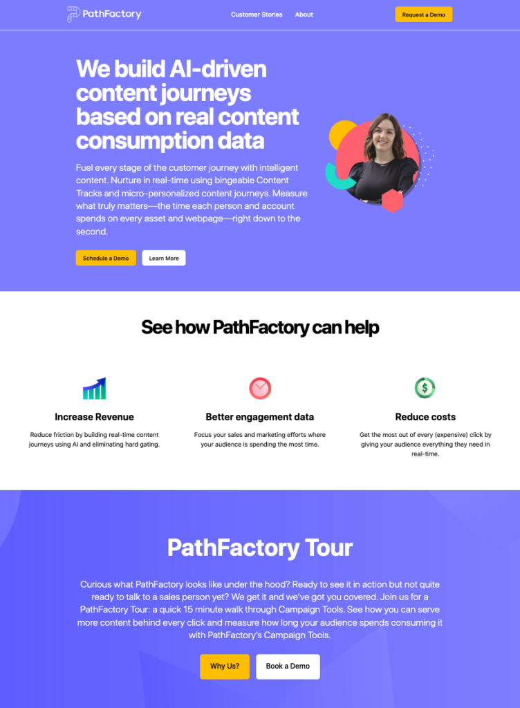
Below is an example of a completed Landing Page.
How to Set up Content Page Templates
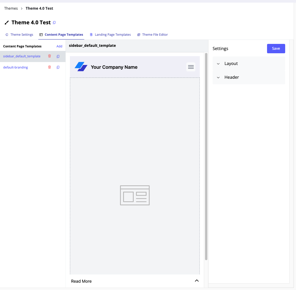
The Content Page Settings tab within Themes is where you set up Templates that can be used when building Content Pages. Any Content Page Templates you create here will populate a list of Content Page Templates a user can select from when building a Templated Experience.
- On the main menu navigation, click the gear icon and then select Themes.
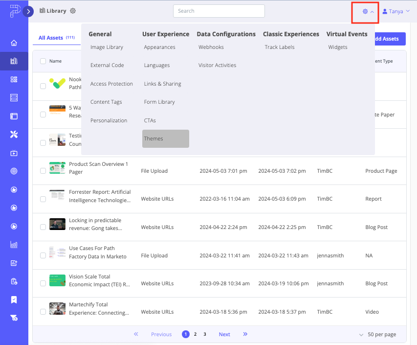
- Select the Content Page Settings tab.
- On the left side of the screen, you will notice a dropdown list labeled sidebar, as shown in the screen capture below.
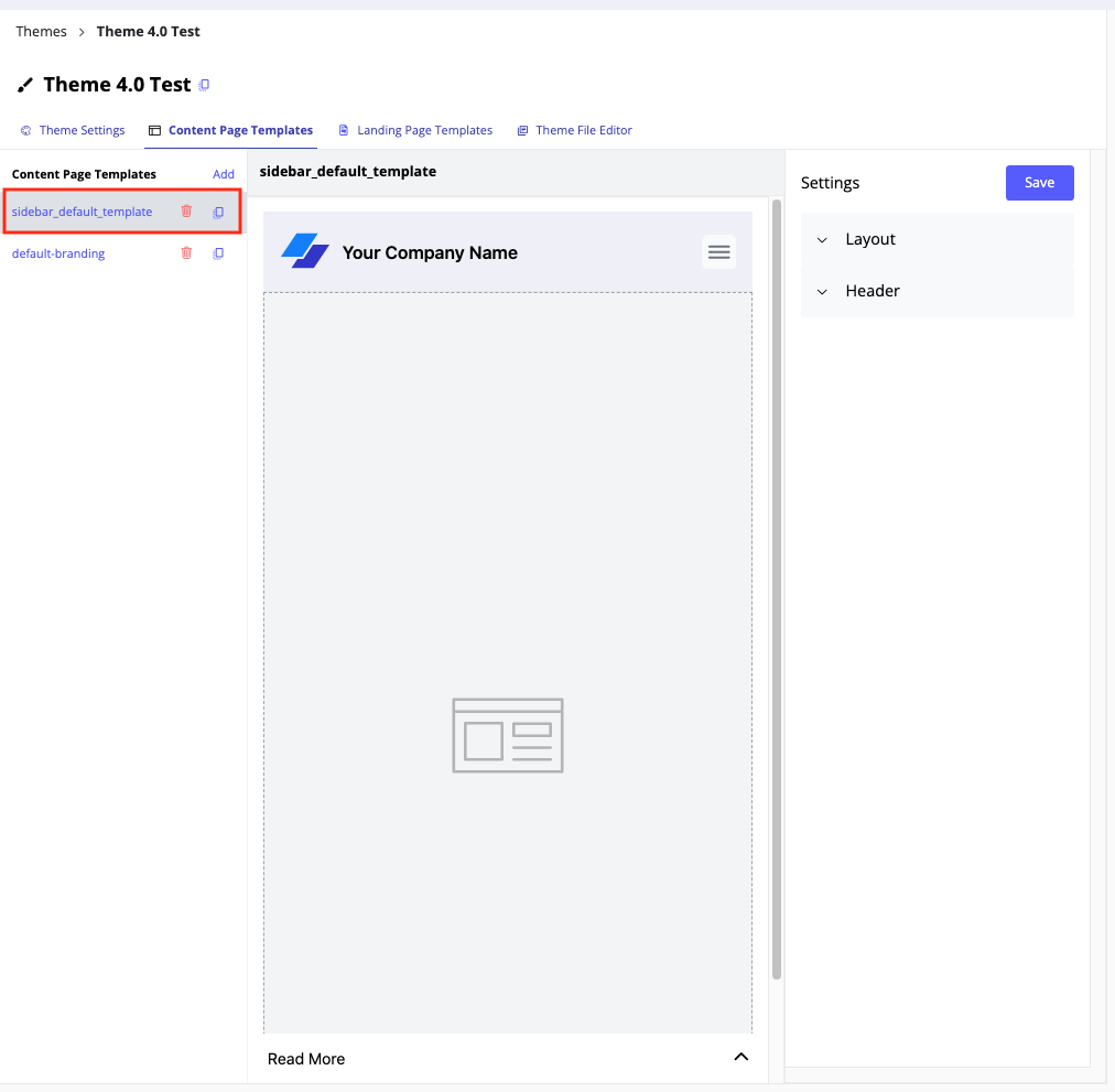
You will also notice other parts of the Content Page Template that are customizable, using options in the right panel.
Layout Menu
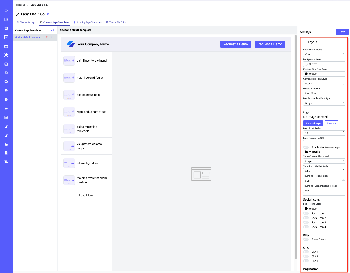
The Layout menu offers the following customizations.
- Background Mode – select color or gradient.
- Background Color – click on this field to show a popup color picker.
- Content Title Font Color – click on this field to show a popup color picker.
- Content Title Font Style – select a heading style from the dropdown list.
- Mobile Headline – enter the text you want to display on mobile views to encourage visitors to continue reading the content assets on the Content Page.
- Mobile Headline Font Style – select a heading style from the dropdown list.
- Logo – change the image, remove the image, and set its size in pixels using the available menus. To display your visitors’ company logos alongside your organization’s logo, activate the toggle labeled Enable the Account Logo.
- Thumbnails
- Show Content Thumbnail – select image or icon.
- Thumbnail size in pixels – using these fields, select the width, height, and corner radius of the thumbnail images.
- Filter toggle – enable the filter toggle to allow visitors to search through the content you have provided using filters; this feature is useful for Content Pages that contain several content assets.
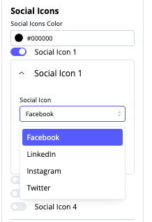
- Social Icons – select the color you want to display for the social icon, and activate however many social icons you want to display on the Content Page. After you activate a social icon toggle, a menu appears for you to select the type of social icon you want to include: Facebook, LinkedIn, Instagram, or Twitter.
- Pagination toggle – activate this toggle to display the number of content assets on the Content Page. Once activated, you’ll see options to customize the Load More button label and its colors that will appear on the resulting Content Page.
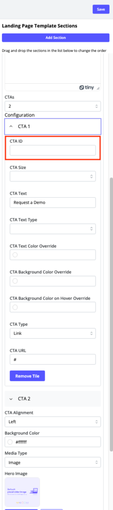
- CTAs – enable up to three CTAs and specify their attributes. Once you toggle on CTA 1, CTA 2, or CTA 3, a menu appears so that you can set its ID, its size, and the text that will appear on the button. Further you can set the button text’s font, color, button color, and button color that displays when a visitor hovers their mouse over the button.
- Dynamic Personalization – To further enhance user engagement, you can enable Dynamic Personalization. This feature allows you to tailor content and CTAs based on visitor data and behavior, creating a more customized and relevant experience for each visitor. For more details, refer to Guide to Using PathFactory’s Dynamic Personalization Feature.
How to Build Landing Page Templates
Below is a step-by-step description of the sections you can configure on this tab to build a Landing Page Template. Note: You may create as many Landing Page Templates as you wish.
Note: To clone a Landing Page Template, read the section following this one.
- On the main navigation, click the gear icon and then select Themes.
- Now you see a list of the Themes that have been created by your organization.
- Select an existing Theme from the list or create your own by clicking Create Theme (top right of screen). For more detailed information on Themes, see the Introduction to Themes tutorial.
- If you selected Create Theme, enter the Theme name and select a Theme Preset (also called a starter Theme) that you will customize to create your new one. (Your PathFactory instance includes a starter Theme file you can modify if you haven’t built one yet.) Click Save when you are finished entering the information.
- Now you are presented with a basic Theme ready for your modification Open on the Theme Settings tab.
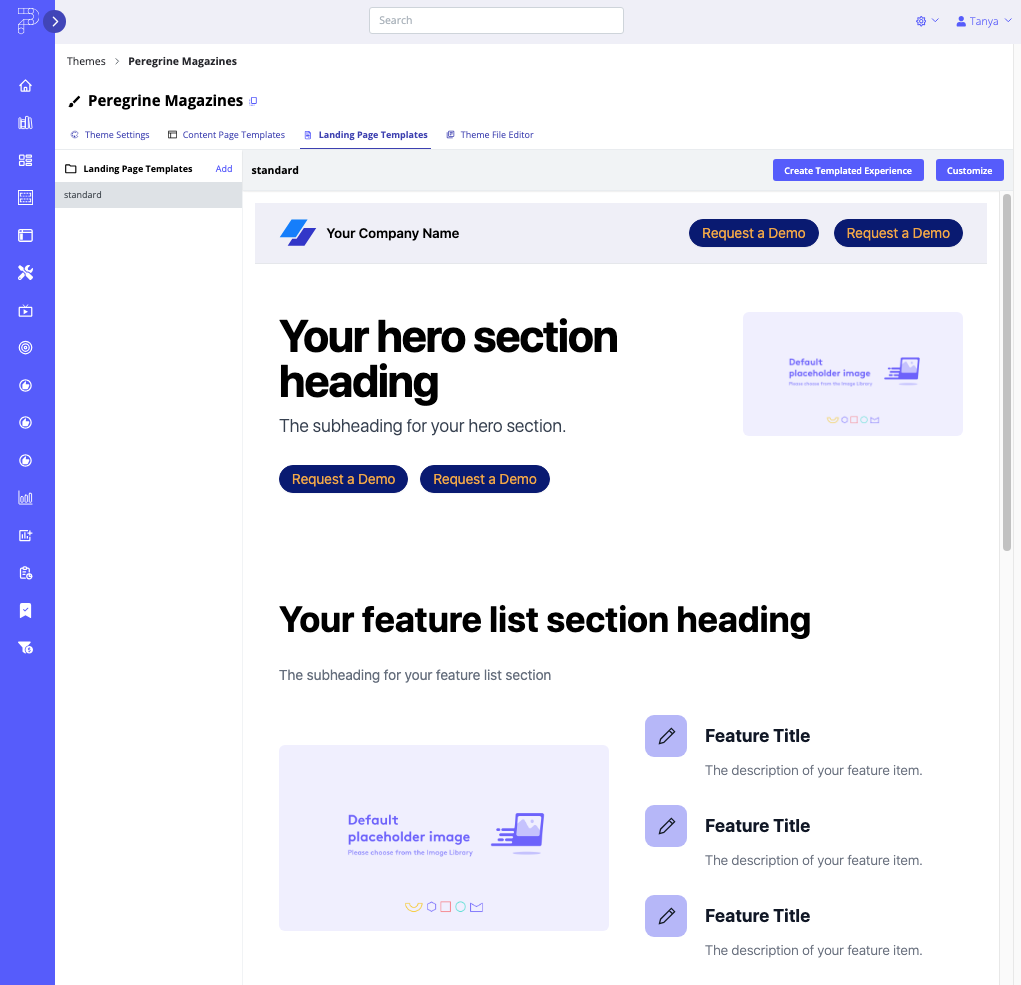
- To create a Landing Page Template, click the Landing Page Templates tab.
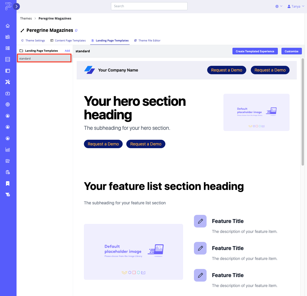
- On the left panel, select the Standard link as shown below.
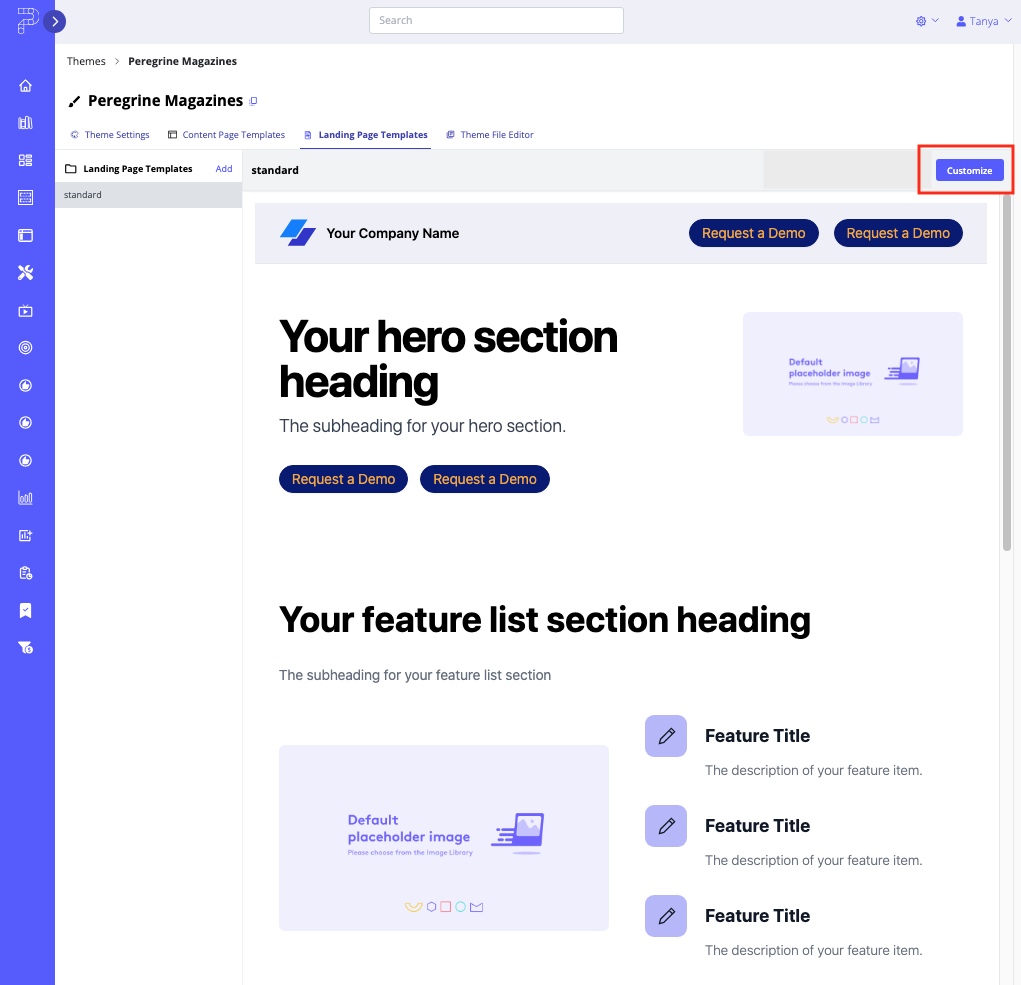
- Click the Customize button on the top right of the screen to begin setting up your Landing Page Template.
- Now you see all of the Sections and Settings within each section that you can customize.
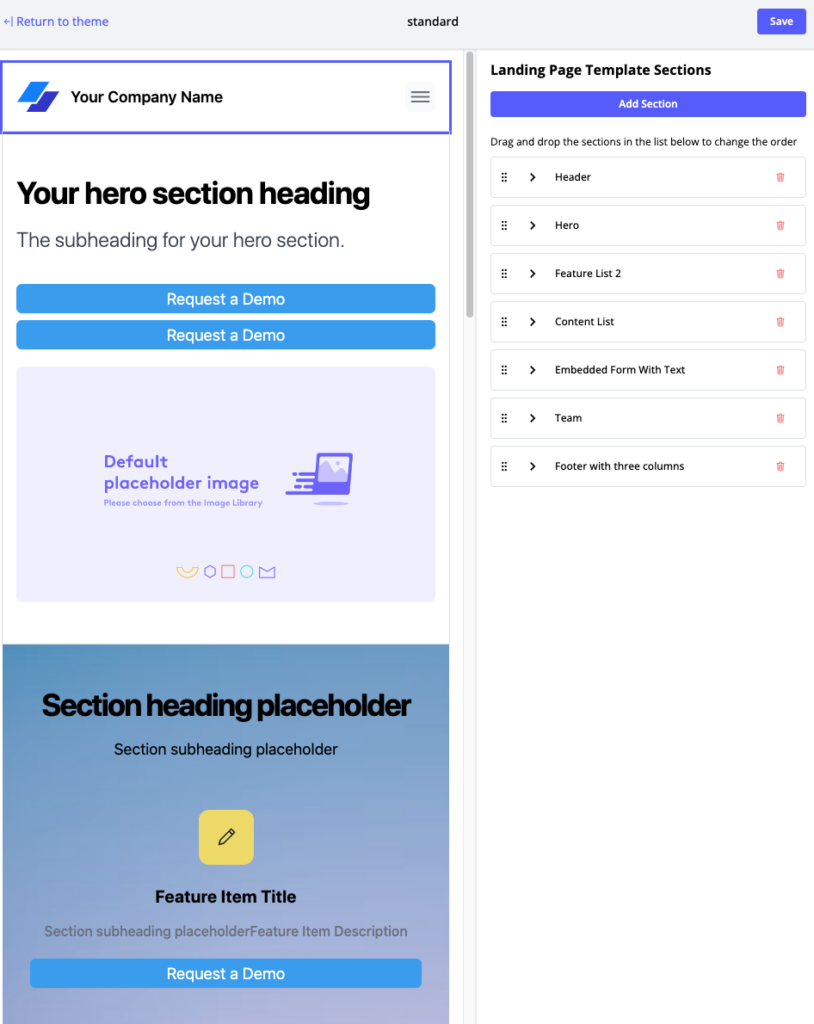
On the right side of the screen you see a list of the default sections and their order. Take a moment to scroll down the panel on the right side and expand the menus for editing Sections to see what is available.
How to Use Out-Of-The-Box Landing Page Templates
To make it easier for you to create highly targeted Landing Page Templates, we’ve added five out-of-the-box templates to help you quickly get started deploying campaigns, events, and demand generation efforts with minimal setup. Each Landing Page Template is fully customizable, allowing you to tailor the layout, content, and design to match your campaign goals while maintaining the overall structure suited to your specific campaign.
Below is a list of available preset Landing Page Templates and a brief description of each.
1-to-Many Template: This Template is Ideal for broad-reaching campaigns. It’s perfect for Content Experiences where you expect large numbers of visitors with diverse interests, and it includes multiple content sections that allow for flexible use based on your use case for the landing page.
1-to-1 Campaign Starter Template: This Template is optimized for personalized, one-on-one outreach to help you kick off targeted campaigns aimed at individual prospects or accounts, with sections built to highlight specific content or messaging relevant to a 1:1 digital experience.
Demand-Gen Starter Template: This Template is focussed on lead generation, helping you build Landing Pages geared toward capturing prospect information. It includes form fields, CTAs, and content areas that drive conversions, making it ideal for campaigns focused on attracting new leads through gated content or special offers.
Event Registration Template: This Template helps you streamline the event sign-up process and promote upcoming events, webinars, and conferences. It includes customizable fields for collecting registration details and features space for event-specific content, making it easy for you to manage attendee information and provide them with relevant details.
Event Follow-Up Template: This Template helps engage attendees after an event has concluded. It includes sections for event highlights, follow-up CTAs, and post-event resources, enabling you to keep the conversation going and provide additional content to prospects based on the event they attended.
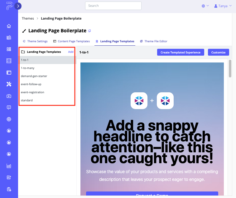
How to Access Out-Of-The-Box Landing Page Templates
Follow the steps below to open an out-of-the-box Landing Page Template to edit.
- Create a new Theme or open a Theme that was created after October 8, 2024 (i.e., when this feature was released).
- With the new Theme open, select its Landing Page Template tab.
- On the left column you will see a list of five Landing Page Templates ready to be customized.
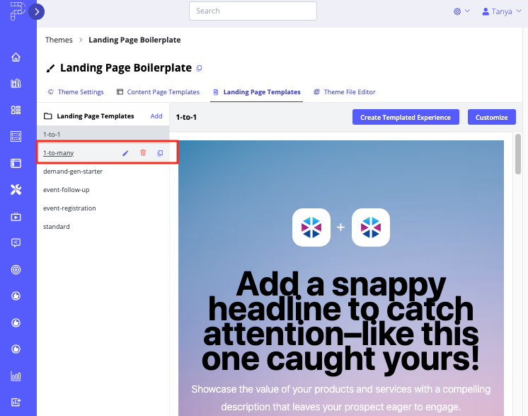
- To manage the Templates, hover over one of them. Three options appear. You can rename, delete, or copy the given Landing Page Template.
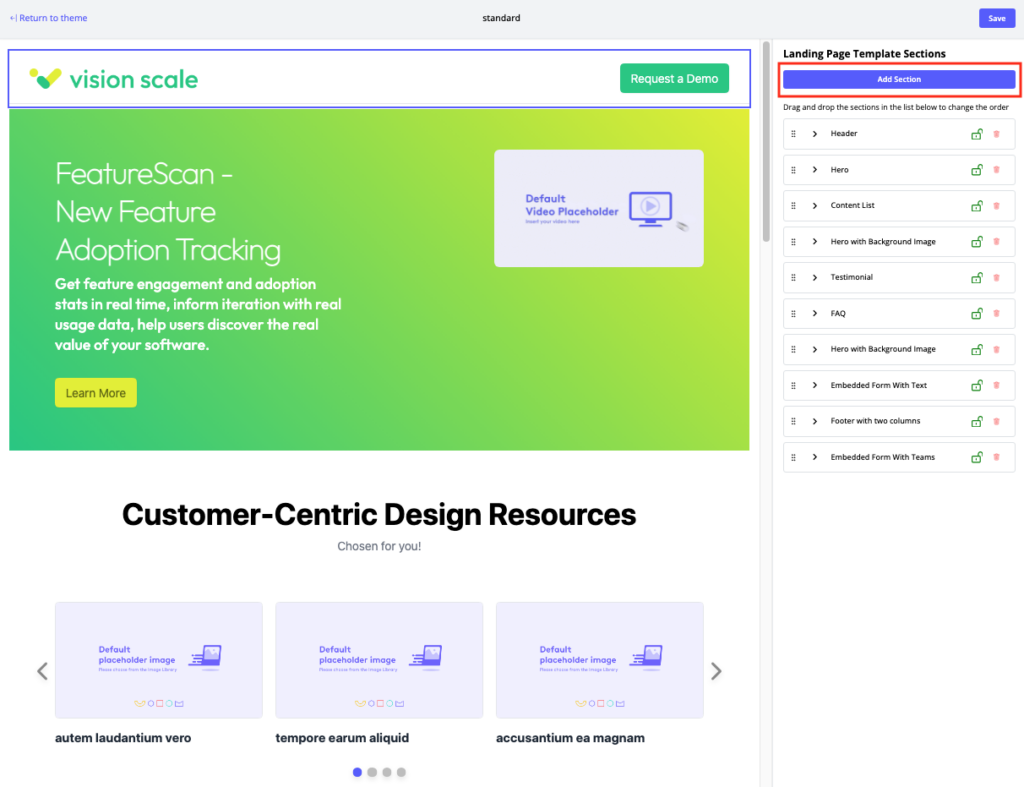
Adding and Managing Sections in Landing Page Templates
The following options are available to add, remove, configure, and reorder Landing Page sections.
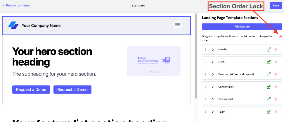
- To change the order of the Sections that will appear in the final project, just click, drag, and drop to a new position.
- To lock the order of the Sections so that other users of the given Landing Page Template cannot change them, click on the lock icon, as shown in the screen capture below.
- To view the Settings for each Section, click on them or the associated arrow next to them, and the associated configuration will expand on the right pane.
- To adjust the space inside a section, activate the Override Padding toggle. Once enabled, you can use the Padding settings menus. Choose the Padding Type from the dropdown list: pixel, %, or rem. Rem stands for “Root em” units, which automatically adjust based on font size. If rem is selected as the padding type, the padding amount will be relative to the font size set in the Header section. Additionally, you can adjust the horizontal and vertical padding using the Padding menus.
Note: Padding refers to the space between the content and the section’s border. When you adjust the padding settings, you’re controlling the amount of space between the content inside a section and the edges of that section. the amount of padding used depends on the specific design goals and preferences, as well as considerations such as readability, usability, and aesthetic appeal. - To remove a Section, click its associated Trash Bin icon, available at the bottom of the Section’s configuration menu.
- To add a Section, click Add Section. A popup menu appears that contains a dropdown list. This list contains available Sections you can add. This feature is useful if you want to modify a Section’s elements. For example, you may want a Team Section to show more than the default of five team members. Or, in a Testimonials Section, you may want to include more than one quote. Scroll down this list to see all of the available Section type options.
Note: All available Custom Sections and out-of-the-box Sections are displayed in the Add Section dropdown menu.
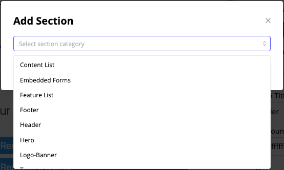
You will notice that if you select an option from the dropdown list, you see a thumbnail preview of your Section selection. Some of the sections have more than one available layout.
Note: If you add a new section to the source layout in a Landing Page Template after you have already created Landing Pages based on the Template, any new sections will be hidden in previously-created Landing Pages. You can manually unhide the new sections on any Landing Pages you wish, but they are set to hidden by default to avoid adding new sections to existing Landing Pages unintentionally.
Available Section Types for Landing Pages
Below is a list of available section types and a brief description of each, to help you decide which sections would suit your Landing Page best.
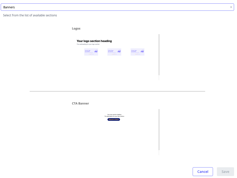
Banners Section
Use this section type to add banners containing CTAs or logos to your Landing Page. There are two layout options available to choose from:
- Logos – this option displays your organization’s logo, partner logos or key account logos throughout the Landing Page.
- CTA Banner – this option enables you to create visually engaging banners with customizable CTAs to direct visitors to specific actions or content.
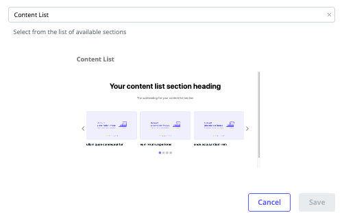
Content List Section
In this section you can organize and present your content assets in a user-friendly format. This structured list can include articles, blog posts, or other informational pieces.
There are some different menus here, as described below.
- Show Content As – Specify Carousel or Grid layout. If you select Carousel, you have the following options.
- Carousel Autoplay – This option appears if you select Carousel layout.
- Carousel Speed (seconds) – Specify how quickly you want the tiles to change over.
- Carousel Tiles – Number of them you want displayed at a time.
- Show Search – Activate this toggle to offer to a search function to visitors.
- Show Filters – Activate this toggle to offer filtering options to visitors.
- Show Content Tags – Activate this toggle to use content tags as labels on the content assets.
- Content List Type – Select an option from the dropdown list – Featured Content, Content Assets, or a Collection that has been added on the Content Configuration tab.
- Featured Content – If you select this option, you can proceed to select the content assets you want to appear first. Use drag and drop to reorder them as necessary by clicking on the dotted grid associated with each content asset. Use the trash bin icon to remove an asset from the Featured Content list.
- Add Content – Click this button to add more content assets to be featured, instead of having to go back to the Content Configuration tab to add it there.
- Only show selected featured content in the Content Page – Activate this checkbox to limit the content to featured content only in the given section.
- Segment Rule Mapping – Turn on this toggle to start the process of selecting a market segment to which you want to display specific content assets. After you activate this toggle, a new link appears, Add Mapping. Follow the prompts to select a segment and then select the content you want to show to that segment.
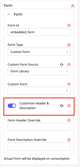
Embedded Forms Section
In this section you can embed forms directly onto the Landing Page to collect user information, such as email sign-ups or surveys.
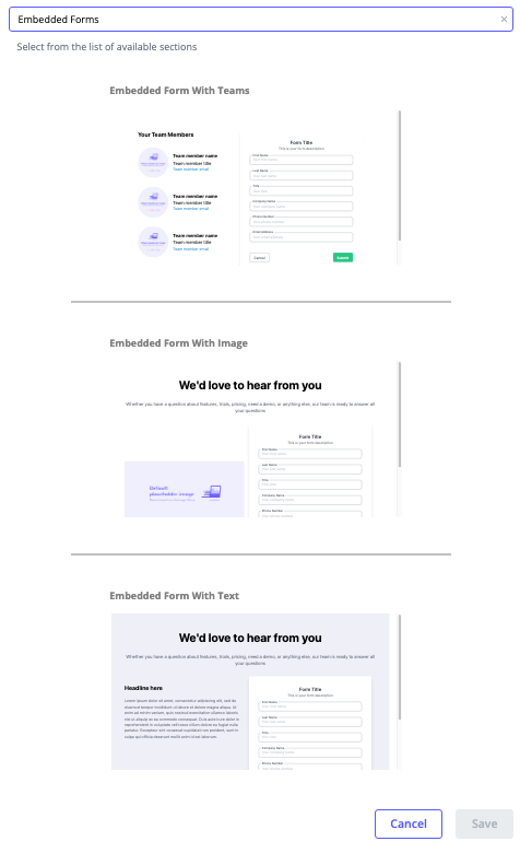
Note: If you select the Form Library as the source for your embedded form within a Landing Page, you can edit both the form’s header and description by toggling on the override option as highlighted in the screen capture below.
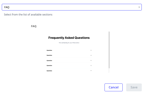
FAQ Section
Use this section to address common inquiries and provide quick information to visitors.
Feature List Section
In this section you can highlight key features or benefits of your product or service.
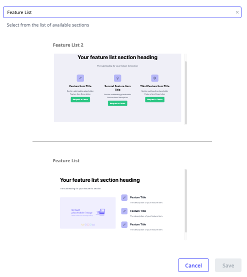
When you add a Feature List section to a Landing Page Template, you are offered layout options, all of which are configurable after being added.
Read below to find out details about the editing menus available for the Feature List section.
General
- Section ID – To connect a CTA to this section, copy the Section ID using the clone icon provided. To find out more about using Section ID, read How to Link to Specific Sections Within a Landing Page Using CTAs.
- Section Title – Enter a name for the section.
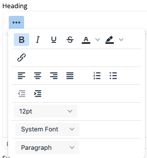
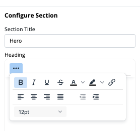
- Heading – Here you can specify the text that will display and the text appearance. To edit the appearance, click on the three dots.
- Subheading – Here you specify the text to appear for the section subheading. If you don’t want a subheading, leave this field blank.
- Media type – Select Image or Video.
- Main Image or Video – Click the Choose button to open your Content Library. From there, select the image or video you want.
- Background Icon Color – Here you can select a color to have on the background of the Landing Page Template.
- Background Icon Border Radius – This setting will round the corners of your background icon.
Card
- Description toggle – turn this toggle on if you would like to add a brief description to the top of this section.
- Cards Alignment – choose center, left, or right from the dropdown list.
- Feature Items CTA – to use a CTA in this section, in the dropdown list choose Button. If you do not want to add a CTA to this section, from the dropdown list select None.
- Feature Items Configuration – select the number of icons you want to display horizontally or vertically, depending on the type of Feature List layout.
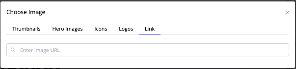
- Feature Cards – Expand each of the Feature Card menus to edit the image, icon size, and title for each card. Click Change Image to view a list of available pictures. You can filter the list by Thumbnail, Hero Images, Icons, and Logos. Want to upload additional images here? On the Choose Image popup menu, click on the Link tab and enter its URL.
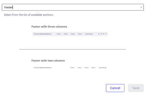
Footer Section
In this section you can include links to important pages (e.g., Contact Us, Privacy Policy), social media icons, and other relevant information in the bottom section of a Landing Page.
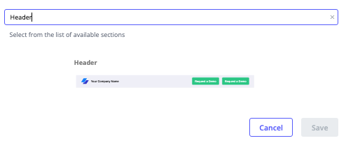
Header Section
Use this section to display your company logo, navigation menu, and a tagline or call-to-action in the top section of the Landing Page.
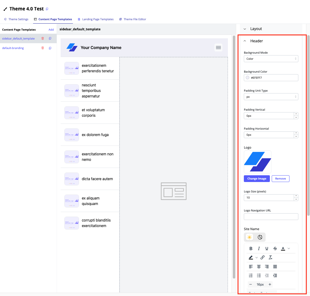
The Header menu offers the following customizations.
Background Mode – Choose Color, Gradient, or Image as the background type for the Header section. Depending on your selection, the menu refreshes to offer options to customize your chosen background type further.
Add on Padding Unit Type – Choose from the dropdown list: pixel, %, or rem. Rem stands for “Root em” units, which will automatically adjust based on font size. If you select rem as the padding type, the amount of padding will be relative to the font size you’ve set in the Header section. Next, set the Vertical and Horizontal Padding, as needed.
- Note: Padding refers to the space between the content and the section’s border. When you adjust the padding settings, you’re controlling the amount of space between the content inside a section and the edges of that section.
Logo – Click Change Image to select your company logo at the prompt. If you don’t want a logo to appear on this page, click Remove.
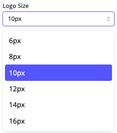
Logo Size dropdown list – Choose a size for the logo using this dropdown list. The size you select for a Logo image affects only the size of the image, not the text that accompanies it.
Site Name – This text is where you enter the company name to be displayed in the Header section of your Content Page.
Note: The site name will not appear when a visitor views the Experience on a mobile device, to reduce visual clutter.
Partnership Logo Configuration
In this menu you can choose to display a partner or account name, related logo and then configure their appearance. This is useful for ABM or partner marketing experiences.
Note: If routing is required for an ABM account (e.g. drive account A to Page A and account B to page B, that can be done using Segments and Routes).
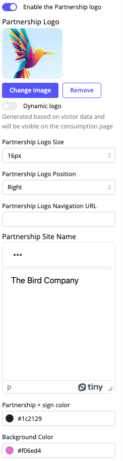
Enable Partnership Logo – To display a partner or account logo, activate this toggle. At the prompt, select the image you want to display here. If you select this option, you then see a menu in which you can add the Partner logo, logo size, logo position, the company name, Partnership + Sign color, and background color of the header section.
Dynamic Logo – Activate this toggle so that when a Content Page is created using this Content Page Template, a partnership logo will be generated based on visitor data and displayed here. If there isn’t an identifiable IP address for the visitor, neither the partnership logo nor the plus (+) sign will not appear to the visitor.
Partnership Logo Size – click here to select one of the preset sizes available.
Partnership Logo Position – click here to put your partner’s logo on the left or right of your company’s name and logo, in the Header section.
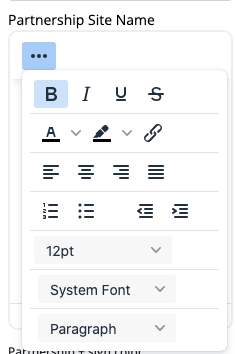
Partnership Site Name – Enter the name of the company here. If you want to customize the font and text appearance for your partner company name, click the three dots.
Partnership + Sign Color – this refers to the plus (+) sign that displays in the Header section.
Background Color – Select a color at the prompt to specify a color that will display in the background of your Header section.
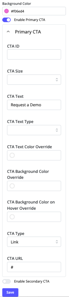
Enable Primary CTA – If you are planning to display a button in the Header section, activate this toggle. The same applies to Enable Secondary CTA.
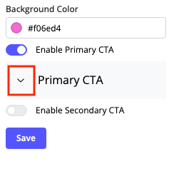
For many more customizations of your CTAs, expand the menu by clicking its arrow as shown in the screen capture above. In the resulting CTA menu, you have several options to track its use and customize the background color of the CTA button, as well as its text size and color.
Dynamic Personalization – You can also enhance the Header section by adding Dynamic Personalization. This feature enables the display of personalized content or CTAs based on visitor data, providing a tailored experience that can increase engagement and conversion rates. See Guide to Using PathFactory’s Dynamic Personalization Feature for more information.
By placing the reference in these sections, you ensure that the information about Dynamic Personalization is introduced at points where customization and user engagement are already being discussed, making it relevant and easy to integrate into the overall content.
When you are happy with your settings, click Save. You may have to scroll down the menu panel to see the Save button. Continue to tweak your Settings as needed, to achieve the look you want.
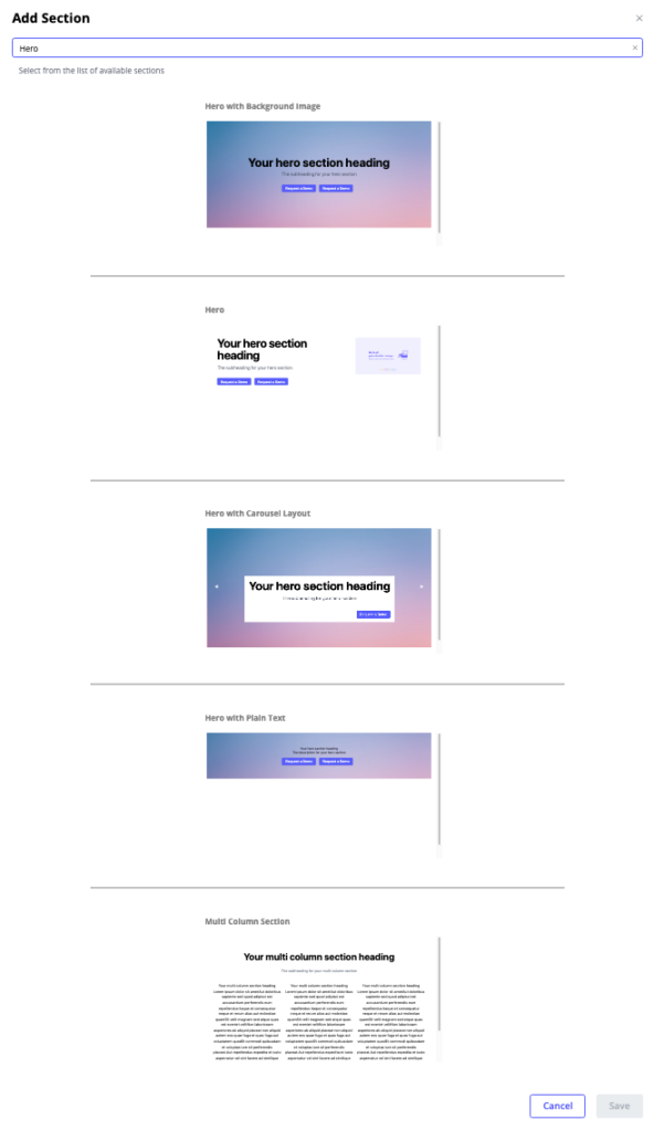
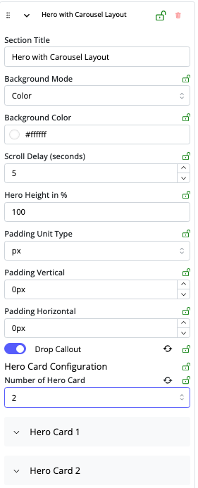
Hero Section
This section type enables you to create a section at the top of the Landing Page that includes a headline, subheadline, and a call-to-action button. You may also add CTAs to the Hero section.
When you add a Hero section to the Landing Page Template you have five layout options.
- Hero with Background Image – this option displays a single hero heading with a single background image.
- Hero – this option displays a hero section with text and CTAs only.
- Hero with Carousel Layout – this option enables you to add a series of images and headings that automatically change according to the timer setting you later choose.
- Hero with Plain Text – this option enables you to embed a full-width video or image for you to feature special assets or call-outs.
- Multi Column Section – this option enables you to organize content in two or three columns. Using this section layout, you can configure the appearance for each column and customize the ratio of each column size relative to each other.
Hero Menu Details
- Section Title – Enter the title you want to display for this section.
- Background Mode – From the dropdown list, select Color or Image.
- Subheading – Enter the text for your subheading. You can also alter the text display and size. Click the three buttons to see options for text, as shown below.
- Primary CTA and Secondary CTA – Click these dropdown arrows to see fields for entering the CTA ID, Size, Text, Text Size, and Text Color.
Note: The CTA ID you enter here must be unique to avoid duplication when tracking.
- Background Color – Click here to select the color you want to display in this section.
- Media Type – Choose an image or video to display here.
- Hero Image – Choose which image you want to use here and choose which side it displays within the section by turning on the Swap Positions toggle.
- Scroll Delay – Set the number of seconds you want each hero card to display before automatically advancing to display the next hero card in the carousel.
- Number of Hero Cards – From the dropdown list, select the number of hero cards you want to display in the hero carousel.
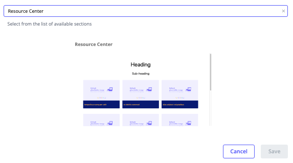
Resource Center Section
Use this section to aggregate various resources such as whitepapers, e-books, case studies, and other educational materials.
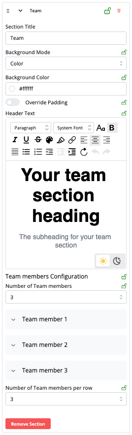
Teams Section
This section offers a layout that displays team members in a horizontal card view, complete with space for customized messaging. Showcase your team members with photos, names, titles, and brief bios.
The Fixed Contact Card layout in Teams (highlighted below) is designed to be persistently present at the bottom of any PathFactory Templated Experience Landing Page as visitors scroll. Consider using this feature to promote an event or a sales rep’s contact information.
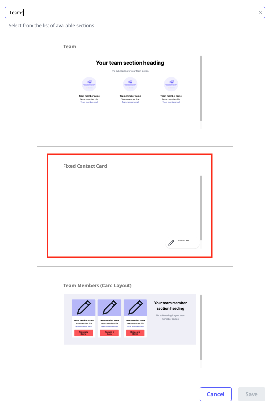
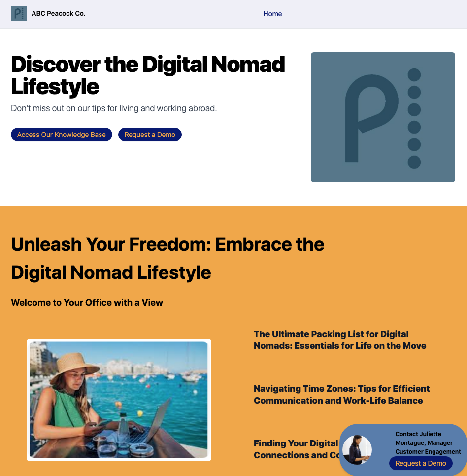
Below is an example of a Fixed Contact Card section in the bottom right corner of a Landing Page.
Team Members Menu
- Section Title – Enter the name for your Team Section here.
- Heading – Here you provide introductory text about your team and configure the text appearance.
- Subheading – Here you add a subheading for your team section.
- Background Color – Click on this field to open a popup menu where you can change the color you want displayed here.
- Team Members – Select the number of team members you want to display here (up to 12). After you choose a number of team members to display, the next menu updates to give you the number of spaces you need for your team members.
Contact Card Menu
If you have chosen the Contact Card layout for the Teams section, you may edit the card using the menu options described below.
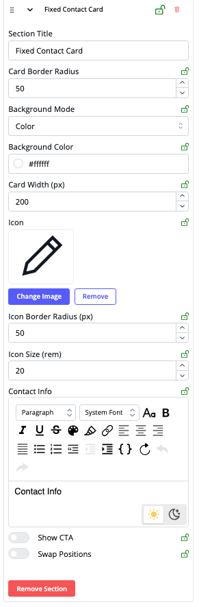
- Section Title – Enter the name you want to appear at the top of the Contact Card for clarity and invitation, ensuring users understand the purpose of the contact card.
- Card Border Radius – Set a rounded edge to the card, making the design more aesthetically pleasing and modern.
- Background Mode – Select from color, gradient, or image.
- Background Color – Click this option to open a color picker to set the background color of the Contact Card.
- Card Width (pixels) – Adjust this setting to change the size of the Contact Card.
- Icon, Icon Border Radius, Icon Size (all in pixels) – Add or adjust the icon you want to display on the Contact Card.
- Contact Info – Add a phone number or email for your prospects to contact the person on the Contact Card.
- Show CTA – enable one CTA and specify its attributes. Once you toggle on a CTA, a menu appears so that you can set its ID, its size, and the text that will appear on the button. Further, you can set the button text’s font, color, button color, and button color that displays when a visitor hovers their mouse over the button.
- Swap Positions – Choose which side you want the Contact Card to display at the bottom of the Landing Page. By default, the Contact Card displays on the bottom right side.
Testimonials Section
Use this section to display customer testimonials showing positive feedback from your existing customers. There are two layouts to select from, as shown below.
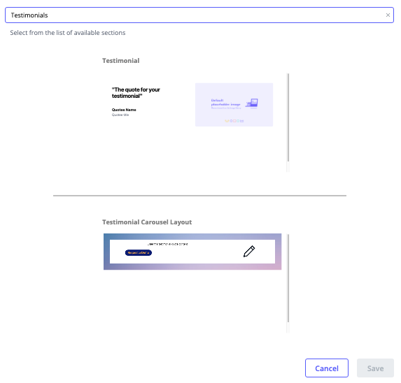
By default, there isn’t a Testimonial Section in the Landing Page Template. You can add one by clicking Add Section at the top of the right panel as highlighted in the screen capture below.
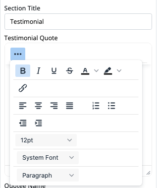
- Section Title and Testimonial Quote – Here you add the text you want to display. You can also alter the appearance of the text. Click the three buttons to open that menu.
- Quotee Name – Enter the name of the person you are quoting.
- Quotee Title – Enter the quotee job title or their preferred headline, for example Vice President of Sales.
- Background Color – Same as for the other Sections, clicking on this field opens a menu for you to select the color you want.
- Media Type – Image or video – same as the other sections, you can add an image or a video here.
- Main Image – Here you can change image, remove image or swap the image position within the section.
Next Steps
Once you have created Themes, Content Page Templates and Landing Page Templates, you are ready to start building digital experiences that we call Templated Experiences. Read Introduction to Templated Experiences for detailed instructions on how to do this.
Views: 835