R is for refreshment! This release has several interface and navigation improvements, starting with the Path Analytics menu.
Within Path Analytics, you’ll notice 2 new menu items: Standard Experiences and Content Intelligence.
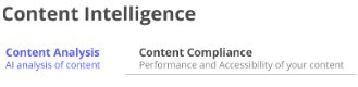
The new menu item for Content Intelligence within Path Analytics has 2 new nested menu items: Content Analysis and Content Compliance:
- Content Analysis provides an overview of all of your content assets, their readability, and average reading time.
- Content Compliance evaluates all of your content assets for their performance and accessibility.
And for Standard Experiences and Website Tools, you’ll see a new aggregated dashboard to view all of your accounts and their related data. We have added tabs for you to view and analyze your accounts and content assets, recommendations, engagement, SEO score, readability and accessibility in a centralized dashboard as it relates to your campaigns (Standard Experiences) and content assets (Website Tools). On both of these new dashboards, you will see a new tab named Full Journey. This tab shows all engagement for your content assets across all accounts, plus an overview of the accounts including their industry, their location, the source of their marketing, and revenue.
Path Analytics navigation
We have renamed Campaign Tools to Standard Experiences. We have also added a new submenu under Path Analytics specifically for Content Intelligence analytics.

New dashboards for Standard Experiences and Website Tools
Within Path Analytics, we have created two dashboards for easier navigation and access to analytic data in a central location, for Standard Experiences and Website Tools. The dashboards enable you to focus on accounts and contacts that engage across multiple campaigns and experiences. You can filter this report by experience and click on the account name for a detailed view. Filters include 6sense data points.
To access these new dashboards and their tabs, click Path Analytics, and then select Standard Experiences or Website Tools.
Standard Experiences dashboard
On the dashboard for Standard Experiences, you notice 7 main tabs plus some filters. On each of these tabs, you can view detailed data analysis.

- Overview – all of the analytic data from all tabs is displayed here.
- Visitors – engagement data for all of your PathFactory experiences (campaigns).
- Accounts – a list of all accounts and how they have engaged with your content.
- Content – On the content tab, you may toggle between overview and insights.
- Overview – This chart visualizes every content asset and associated type engaged with in this period. Use this data to uncover trends in content engagement, content types, cost and views.
- Insights – This data uncovers details about your topic use as it relates to engagement time and total visits across the number of content assets in each topic.
- Reports
On the Reports tab you can generate many different reports about your data. On the right column, there are active links to reports, as shown below.


- Custom Reports – Here you can select a folder on the left panel to see the details of the report or analytics you have stored there.

- Full Journey – Read the section later in this document to find out about this tab.
Website Tools dashboard
On the main screen for Website Tools, you’ll notice 6 tabs, and many more filters than on Standard Experiences.

The tabs are as follows.
- Overview – this tab provides numerical and graphical information regarding number of visitors, their engagement with your content, trends, and UTM parameters.
- Recommendation – this tab provides insights into the performance of content recommendation made by PathFactory Content Intelligence
- Visitors – displays number of unique, new, and returning visitors, along with their binge rate, average time spent, and average time spent per asset.
- Accounts – lists number of new and returning accounts, visitors per account, and average time per account. You also see a map and a list that contains account locations. To find out more about this tab, read the section below.
- Content Engagement – displays engagement for unique assets, total assets, total engagement time. You also see the average for scroll depth, views per session, views per asset and view time.
- Full Journey – read about this tab and what it does, in a section below.
On both dashboards you have Filters to isolate the data you want to analyze.
Accounts tab
The Accounts tab on the new Standard Experiences and the Website Tools dashboard provides a detailed view of your organization’s accounts, enabling you to analyze your accounts’ behavior across all PathFactory experiences.
To access this dashboard, you have two options:
- Click Path Analytics, then click Standard Experiences. From there, select the Accounts tab.
OR - Click Revenue Intelligence, then select the Accounts tab.
When you click on an account name, you see the consolidated data from all PathFactory experiences related to that account. The user can filter the report by experiences (Standard Experiences or Website tools).
Full Journey tab
This tab displays insights for a specified account or a group of accounts (according to the filters you’ve chosen), and displays them all in graphical format for easy analysis.

Here you notice the following features:
Filters – add or modify a filter to drill down to the data you want to look at.
Account Summary – a list of accounts, the experience they engaged with, their industry, marketing source, and their engagement statistics. Showing the engagement data points in the account hierarchy screen enables the user to choose an account for review.
- When you click on the account hierarchy icons, the engagement data points like time spent, new buyers, # content engaged and % change.
- For Inactive accounts you see the last engaged date under the Time Spent column.
Contents consumed across all PF experiences – this panel lists the Experience (campaign), its Unique Visitors, Asset Views, Total Engagement Time and Average View Time.
Content Intelligence dashboard
When you select Content Intelligence from the Path Analytics main menu, you see two tabs at the top of the screen.
Content Analysis

Using these new tools, you can evaluate your content assets as follows:
- Total number of assets
- Total number of collections
- Asset distribution – readability score
- Read time – average of how long it takes to read each content asset.
- Language Asset Distribution – which languages appear in your assets and in how many assets.
You’ll notice on each square of data, you have an option to download the data contained there, or refresh your results. Hover over the data square and then click the 3 dots that appear.

Content Compliance

On this tab you’ll be able to evaluate the performance and accessibility of all of your content. You’ll see analytics for:
- Number of web pages analyzed, Number of HTML tags analyzed
- Average accessibility compliance of web pages, Number of HTML tags in Accessibility across web pages
- Number of web pages analyzed for SEO, Number of HTML tags analyzed for SEO
- Number of HTML tags with Accessibility issues, Number of HTML tags with SEO issues
Save and share data reports with others
You can save these results and share them with others in your organization. To see the saving and sharing options, click the settings gear on the right side.

There you see the following options:
- Clear Cache & Refresh – this option lets you reset the search filters to default and run it again.
- Download as PDF

- On this popup menu, you have options on what to name the file (or you can leave it as the default), and the layout of the resulting file. You also see a button Open in Browser, that lets you preview the PDF in a separate browser tab. From there you can download the file or print.
- Download as CSVs – if you select this option, you will download a CSV file in a zip format, to a folder on your computer’s hard drive.
- Send – this option opens a popup menu for you to specify to whom you want to send this data, the method in which you want to share it (email, webhook, Amazon S3, SFTP), and the format (PDF, Visualization, CSV ZIP file).

- You also notice the Filters and Advanced options here. The advanced options include layouts and whether to include links with the data.
- Schedule – this option lets you plan on when to run the analyses.

- You will notice this looks similar to the Send popup menu described above. You have options to name the scheduled analysis, how to share this data, who to send it to, and its format. You can also set up the analysis interval, and when to deliver it.
If you expand the Filters and Advanced options, you’ll see the same options as before. You can decide which filters to apply, and the layout.

After you have applied all of your filters and specified format and recipients, you can click Send Test to make sure the report looks right, before sending it out to clients.

Social sharing for VEX sessions
With this release, you can configure links and sharing options that the visitors of your session are able to engage with. This new functionality provides you with the convenience and flexibility of sharing session details via various channels such as email and social sharing, to dramatically increase the visibility of your planned event. You can mail the link directly to your clients, add it to your email signature, or …

By default, this toggle is off. To turn it on, follow these steps.
- Within the Content Activation menu, navigate to Virtual Events.
- Select the Virtual Event and then click its corresponding Configure link.
- Select the Sessions tab.

4. Scroll to the bottom of the tab and activate the toggle for Links and Sharing.

5. Save the changes made. Now your virtual event has a link on it, allowing those with access to share the event with others.
Note: This configuration is limited to the desktop.
Support for GA4 ID
Google is replacing its Universal ID to GA4 ID. As part of its plan to replace Universal Analytics, it will stop processing new data starting July 1, 2023. For those of you who have already transitioned to GA4 ID, we have added a field for you to enter this value. Previously, in the organization settings, we used to have only one option to add a tracking ID. For this release, we have added support for all customers who have started using GA4 ID and also maintain support for the customers that haven’t yet transitioned.
Configure your GA4ID by following these steps.
Configure your GA4ID by following these steps.
- Navigate to Organization Settings, and then select the Settings tab.
Settings tab
- Enter GA4ID from your Google Analytics account in the GA4ID field.
Google Analytics field
- Scroll to the bottom of the screen and click Save.
Note: if you have configured both the Universal ID and GA4ID, the PathFactory script will prioritize GA4ID over the Universal ID. If you want the Universal ID to be disabled, please contact your CSM or email support@pathfactory.com.
Views: 141