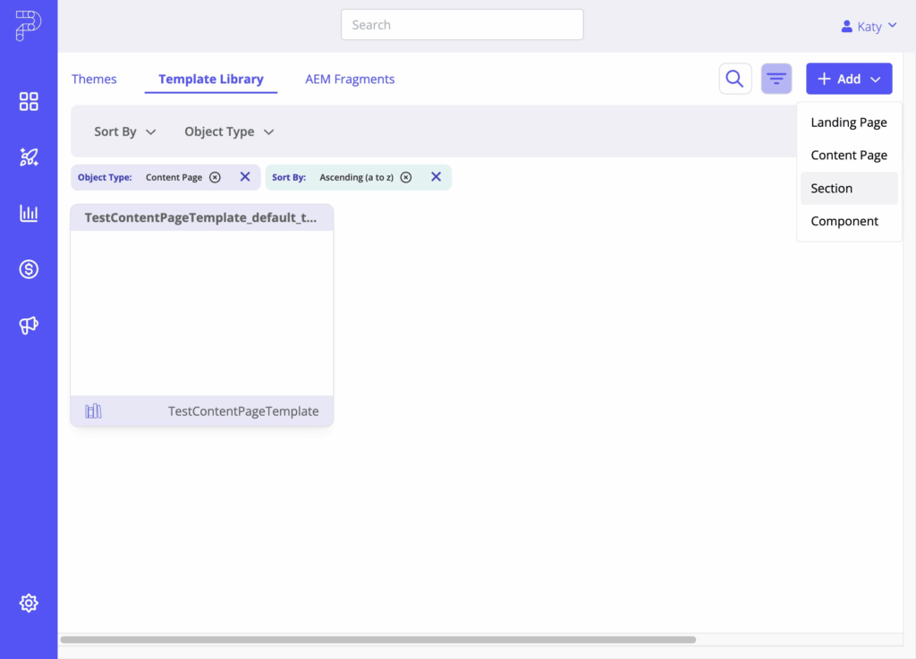
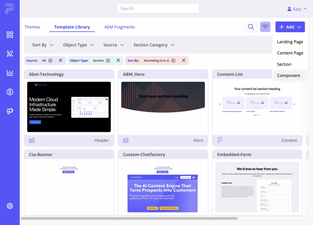
The Template Library in PathFactory’s Themes module stores all reusable layouts and building blocks for your landing and content pages. You can filter by Object Type and Source to find what you need.
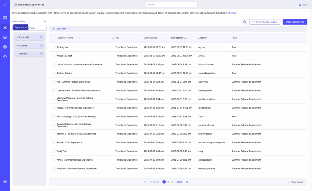
Start by navigating to Themes. Click on “Experiences”
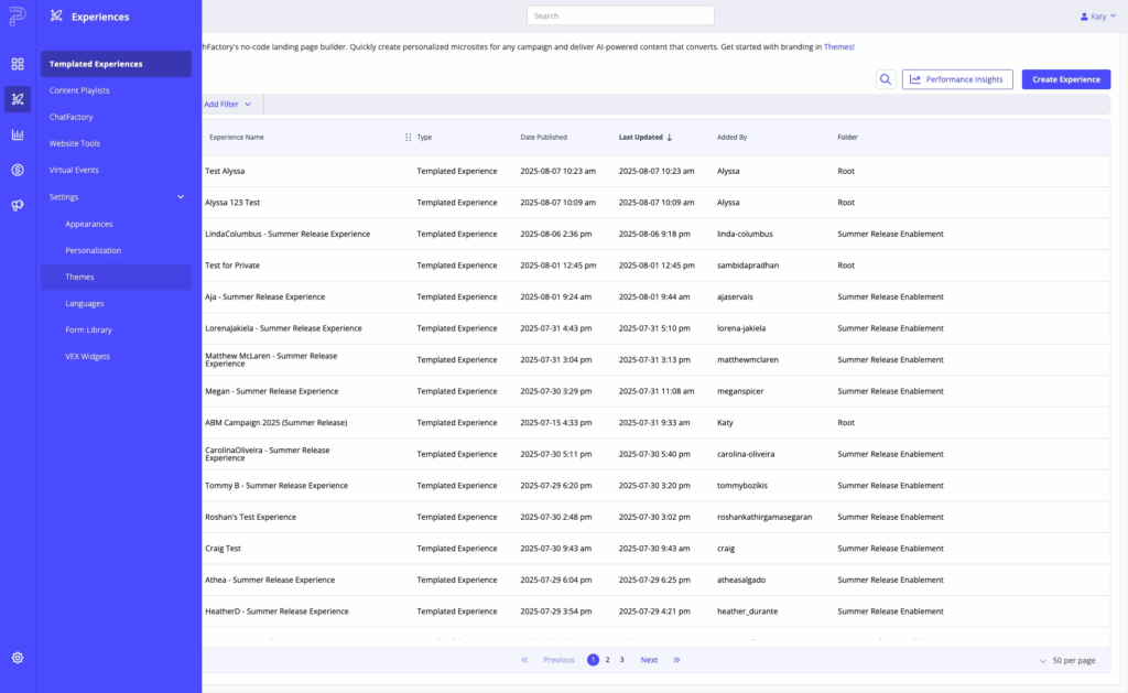
Under the Settings Menu, click “Themes”
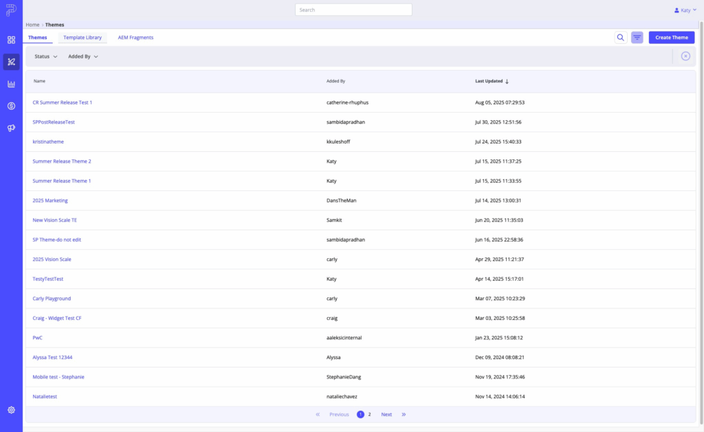
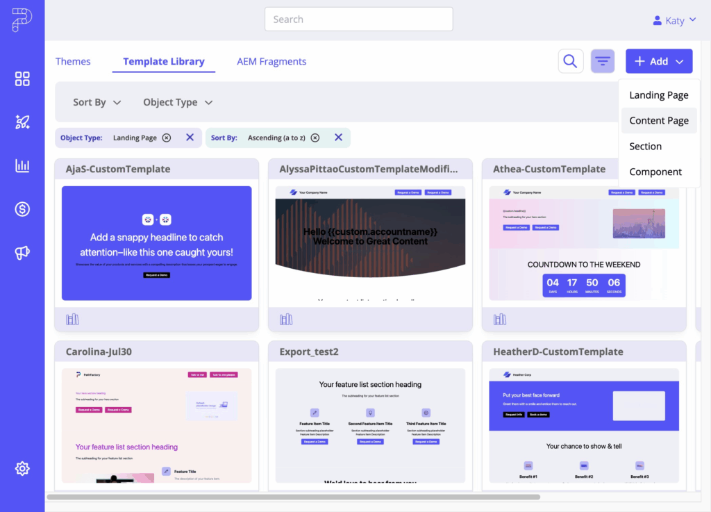
Click on the “Template Library” tab:
Once you land in the Template Library, you’ll see a variety of filter and sort options to help you navigate.

Object Types
There are four object types housed in PathFactory’s Template Library. Each of these acts as a different building block that makes up your Content Experiences that can be reused across all your landing pages and playlists.
- Landing Page Templates – Define the structure and layout for Templated Experiences. Use for reusable campaign pages.
- Content Page Templates – Define layouts for Content Playlists and multi-asset experiences. Designed for a consistent, focused viewing experience.
- Sections – Layout blocks that make up templates. Can be PathFactory Default or Custom (built with Liquid) and organized into categories.
- Components – Small, reusable elements used inside sections.
Source filter:
- PathFactory Default – Provided by PathFactory.
- Custom – Created by your organization in Liquid.
Adding Objects to the Template Library
From + Add, choose the object type you want to create.

Landing Page Template
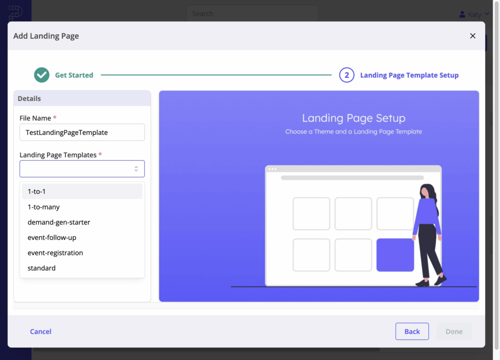
Select Landing Page.

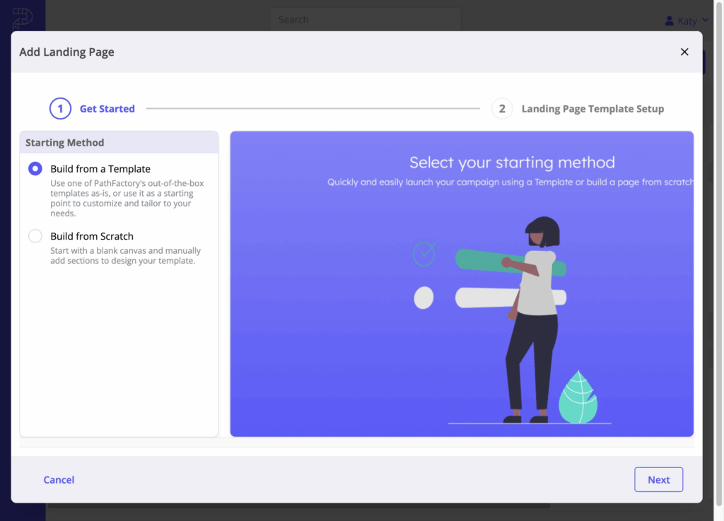
Choose your starting method:
- Build from a Template – Use a PathFactory Default template as a starting point and customize it.
- Build from Scratch – Start with a blank canvas and manually add sections.
Enter the file name and, if applicable, select a starting template. PathFactory provides several out-of-the-box template starters:
- 1-to-1 – Tailored for highly personalized, account-specific campaigns.
- 1-to-Many – Ideal for broader audience campaigns where personalization is lighter.
- Demand Gen Starter – Pre-built for lead capture and conversion-focused campaigns.
- Event Follow-Up – Designed for post-event engagement, highlighting resources and CTAs.
- Event Registration – Optimized for promoting events and collecting sign-ups.
- Standard – A flexible, general-purpose layout suitable for multiple campaign types.
- The editor opens in a WYSIWYG-style view where you can:
- Add and arrange sections
- Apply branding (fonts, colors, images)
- Insert content or placeholders
- Configure global and section settings
Content Page
Select Content Page.
Choose one of two options:
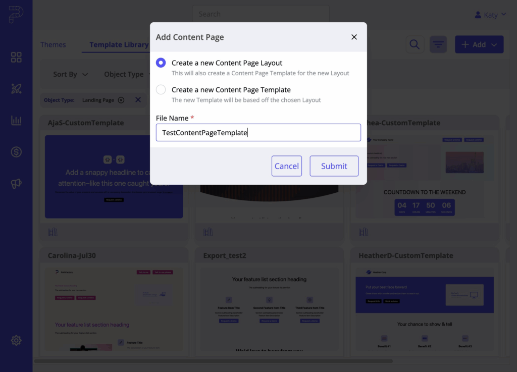
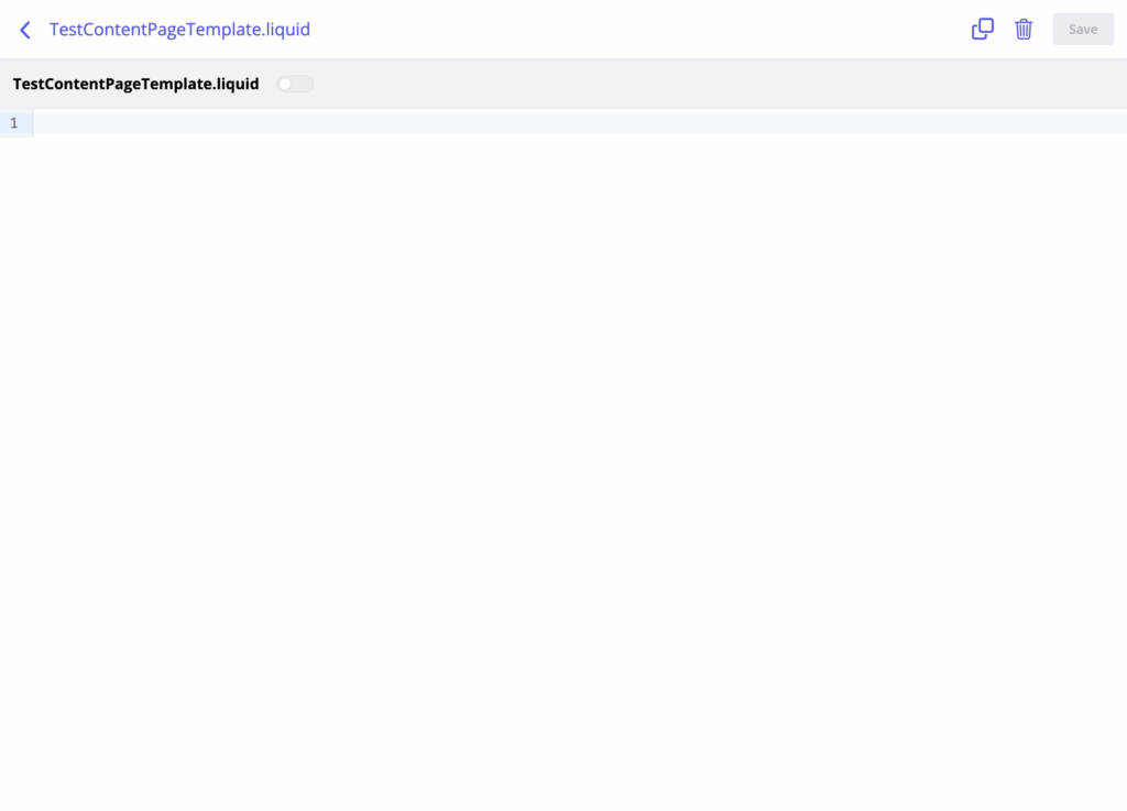
- Create a new Content Page Layout – Opens a blank Liquid editor for building a layout from scratch. Use this for full control over structure and styling.
- Create a new Content Page Template – Select an existing layout (e.g., sidebar) as the foundation. This opens in the WYSIWYG-style editor for quick adjustments.
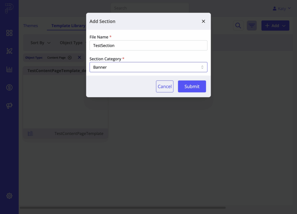
Section
Select Section.
Enter a name and select a category (e.g., Banner, Content, Form).
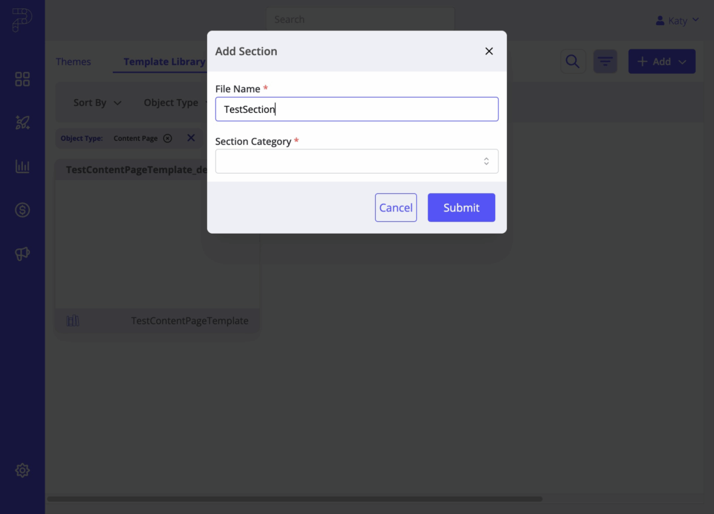
A blank Liquid editor opens for you to build the section from scratch.
Component
Select Component.
Enter a name.
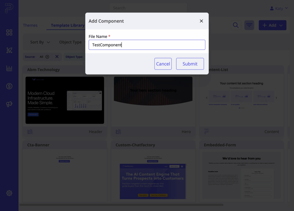
A blank Liquid editor opens for you to build the component from scratch.

Cloning or Editing an Existing Object
When you click on any object type in the Template Library, the QuickPane opens on the right-hand side. It displays:
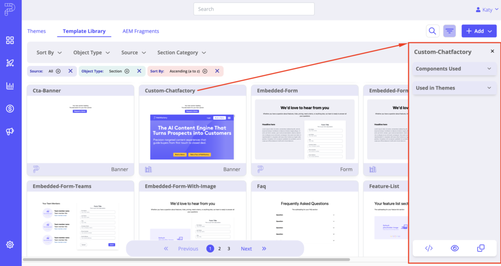
- Components Used – Shows which components from the library are referenced in that section or template. This helps you understand dependencies, so if you modify a component, you’ll know which sections are affected.
- Used in Themes – Lists the themes where the selected object is used.
- Preview – Opens a preview of the object.
- Clone – Creates a duplicate of the object so you can modify the code without altering the original.
- Edit – Opens the code editor for direct changes. Note: You can only edit custom objects; PathFactory Default objects cannot be edited.
Naming Conventions
Creating Custom Sections and Components
Accessibility: Use semantic HTML, ARIA labels, and ensure keyboard navigability.
Theme File Editor Tools: Linting, collapsible code blocks, autocompletion, styling, light/dark mode, and enhanced error messaging.
Selector Strategy:
- Don’t change existing IDs/classes.
- Prefer classes over IDs.
- Declare selectors as Liquid variables.
- Use unique selectors in the format:
{{ Component_description }}-{{ node-id }}-{{ component-id }}-{{ specificity }} - Arrange selectors top-down; avoid ancestor chains.
Component Development Tips:
- Declare props at the start with examples.
- Keep JS with the component unless it’s a shared helper.
- Store shared functions in a helpers folder.
How to Add a Custom Section to a Single Theme File
Instead of adding custom sections or components to the Template Library, you can create them directly within a specific theme’s theme file. This approach is useful when:
- You have unique branding requirements for a particular theme.
- You want to restrict marketer access to certain sections or components by tying them only to specific themes.
- You need to ensure certain layouts or styles are exclusive to a campaign, region, or business unit.
Theme-specific sections and components won’t appear in the global Template Library, keeping them separate and ensuring only users working within that theme can use them.
Follow the steps below for instructions on how to proceed.
Start by navigating to Themes. Click on “Experiences”
Under the Settings Menu, click “Themes”
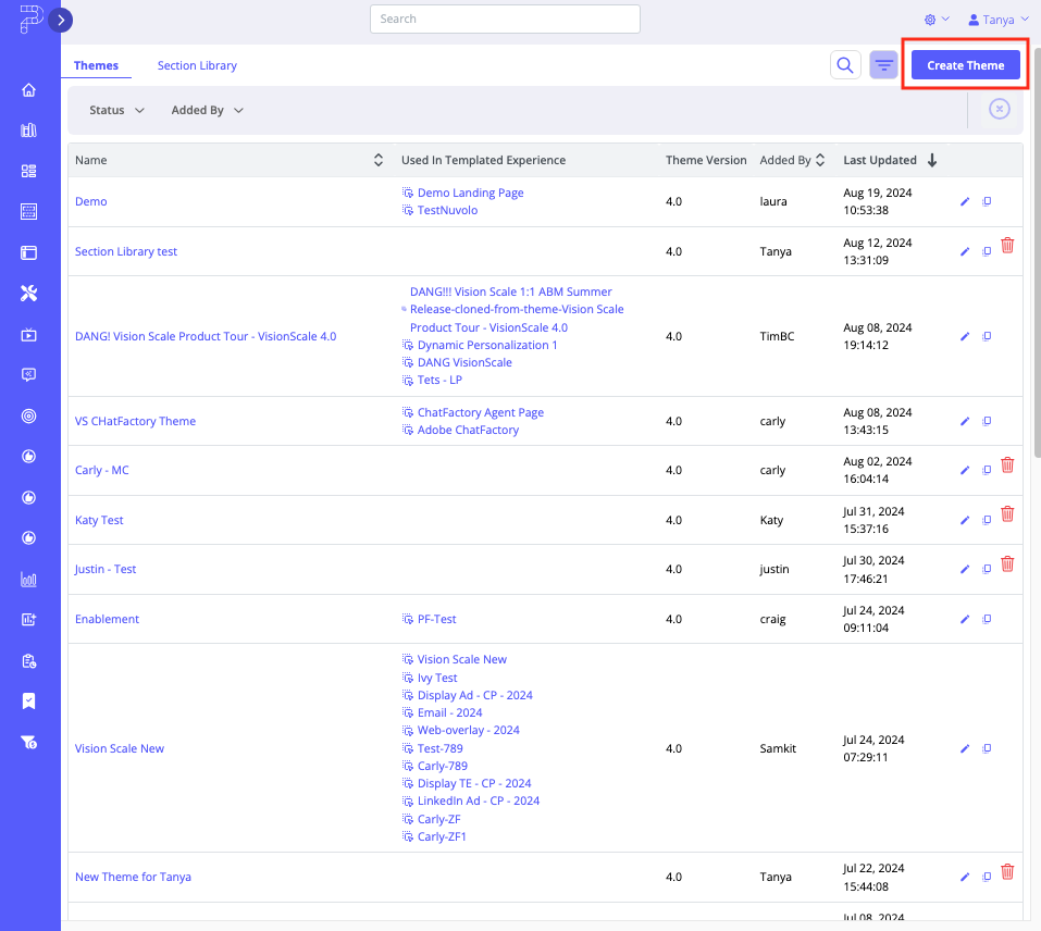
The Themes tab opens. To create a new Theme, click Create Theme. To modify and add Custom Sections to an existing Theme, choose the Theme file from the list of Themes.
- For new Theme files, a popup menu appears for you to enter a Theme Name, select the Theme Preset you want to use and then select a Status (Active or Sandbox). Save the file to continue.
- The Theme file opens. Select its Theme File Editor tab.
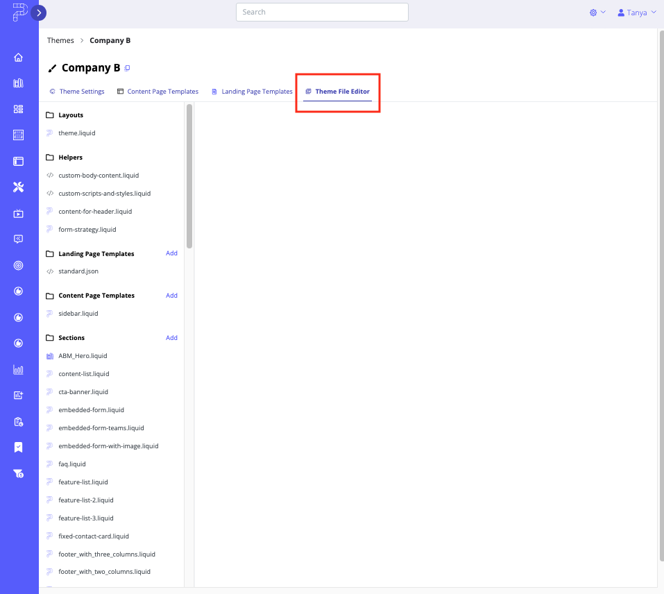
- To add the new Custom Section, click the Add link beside the Sections heading.
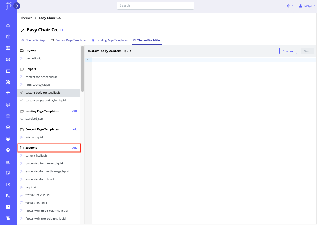
- A popup menu appears. Enter a Filename for your new section, and then select a Category from the dropdown list.
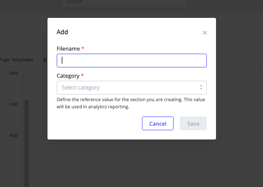
- To finalize adding the Custom Section, click Save. To exit without saving, click Cancel. The Custom Section will appear in the list on the Theme File Editor tab along with the other sections and components, and is automatically added to the Section Library.
Views: 388