Templated Experiences are built using flexible, modular sections. This guide outlines all available out-of-the-box section types, grouped by category. These layouts live in the Template Library, found in the Themes module, where layout options are centrally managed and branding is applied.
Configurations can be found in the right panel of your Templated Experiences Page Editor.
⚙️ Global Configuration Options
Most sections support some or all of the following configuration settings:
General – Contains the Section Link ID, used to create anchor links to this section from navigation menus or CTAs. The Section Link ID cannot be changed.

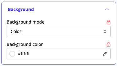
Background – Set a background as a solid color, gradient, or image. Each option includes styling controls.
Layout – Includes an advanced toggle to override default section padding for custom spacing.

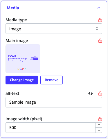
Media- An image / video picker that allows you to choose an image from your Image Library, upload an image, or select any video from your Content Library. Add alt text, control size by increasing width.
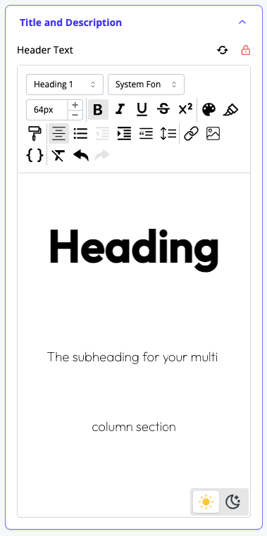
Title and Description – Rich text editors for the section title and supporting description. Each can be styled and formatted independently.
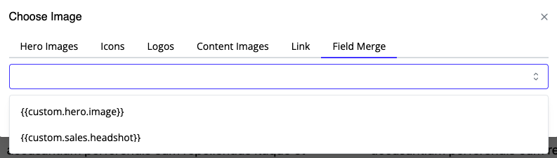
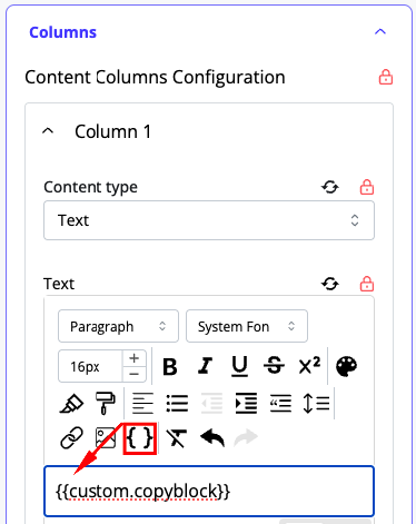
Dynamic Personalization – In any rich text editor, image picker, video picker, or open text field (including CTA text), you can insert custom field merges defined in the Segment Rules area. These merges personalize content dynamically for each visitor.
🎞 Animations
Animations can be applied to any section or element on the page. This helps draw attention to key content, create visual flow, or simply make the experience more dynamic.
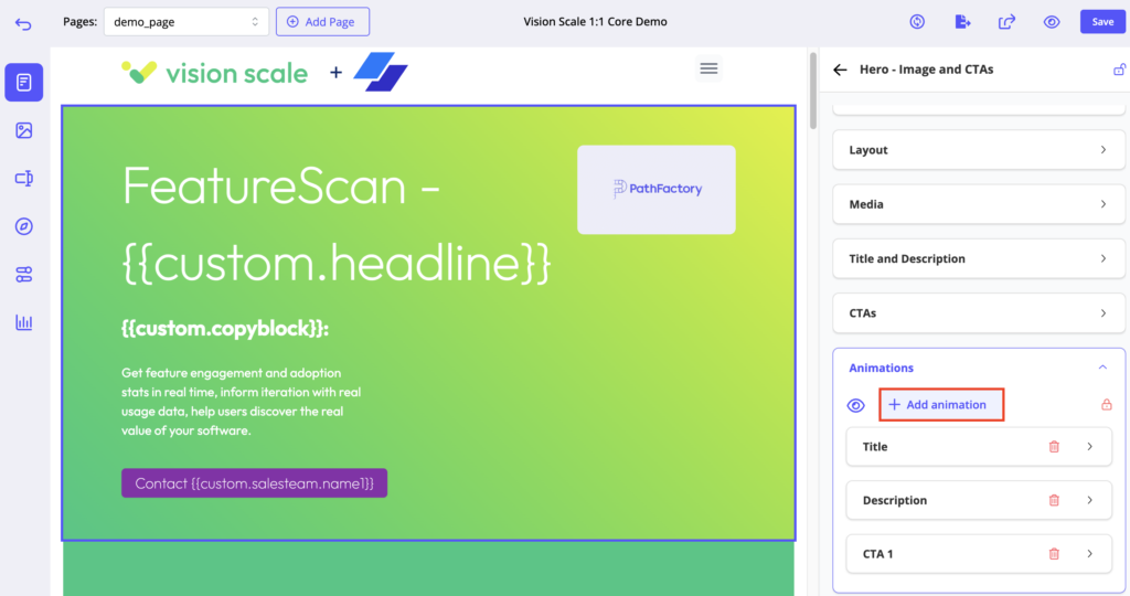
How It Works
- Click “+ Add animation” from any section.
- Choose the target element (e.g., title, subheading, Column 1, etc.).
- Select your desired animation type.
Animation Types
| Animation Type | Description |
|---|---|
| Expand | Grows the element outward from nothing |
| Fade In | Smoothly fades the element into view |
| Slide In | Slides the element in from left, right, top, or bottom |
| Squeeze | Shrinks and re-expands the element (attention-grabbing) |
| Typewriter | Types text in letter by letter (only for text elements) |
Additional Controls
- Trigger
Choose when the animation starts:On Load– Starts when the page loadsOn Scroll– Starts when the element scrolls into view
- Duration
Sets how long the animation takes from start to finish (in seconds). Longer = slower. - Delay
Wait time before the animation begins (useful for staggering animations across a section). - Looping
Toggle to repeat the animation. You can set a Loop Delay to control how long it waits between repetitions.
Previewing Animations
- To preview a single section’s animations, use the preview icon beside the “Add Animation” button in the section settings.
- To preview animations across the entire page, click the main preview icon in the top navigation bar of the editor.
📂 Section Categories & Types
Banners
CTA Banner
A flexible hero-like block that includes a headline, subheading, and optional CTA.

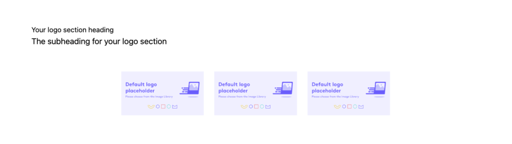
Logo Banner
Displays static or dynamic logos for your company, partners, or accounts. It’s commonly used in co-branded experiences.
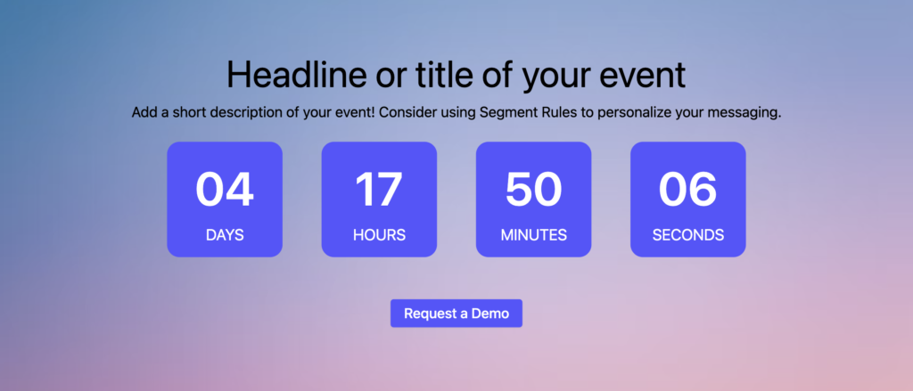
Countdown Timer
Shows a live countdown for events. Before the event, it displays a styled timer, heading, subheading, and optional CTAs. Once the countdown ends, it transitions into a fully customizable multi-column layout. You can configure up to three columns, each containing text, image, video, or a form, making it perfect for post-event recaps or on-demand content.
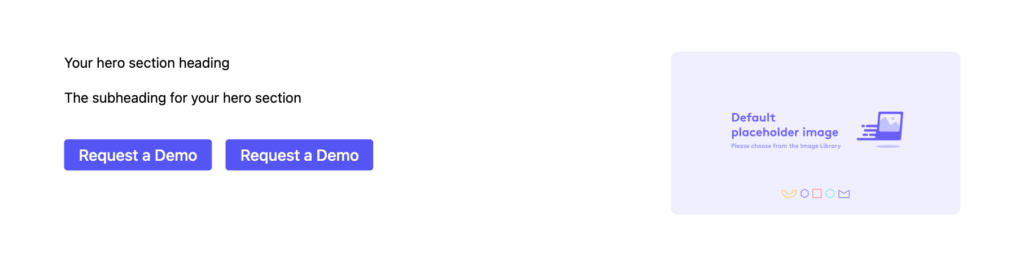
Hero with Plain Text
A small banner layout featuring a background image, short text, and optional CTAs. This section was previously grouped under “Hero” but belongs here.

Content
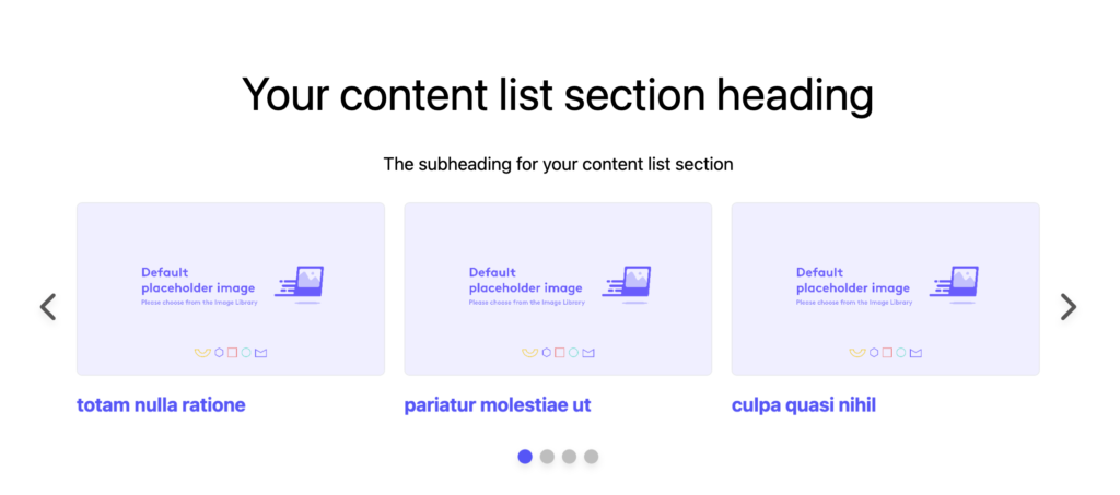
Content-Carousel
Used to display featured content assets in a grid or carousel layout. This section supports sorting, tagging, filtering, and search. You can show content from a static list, a featured selection, or a Collection. Segment Rules can be applied to show different content to different audiences.
Feature List
Feature List – 3 Cards
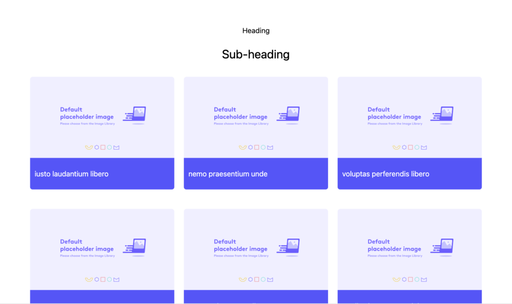
Displays a visual layout with a placeholder image on the left and a vertically stacked list of features on the right.

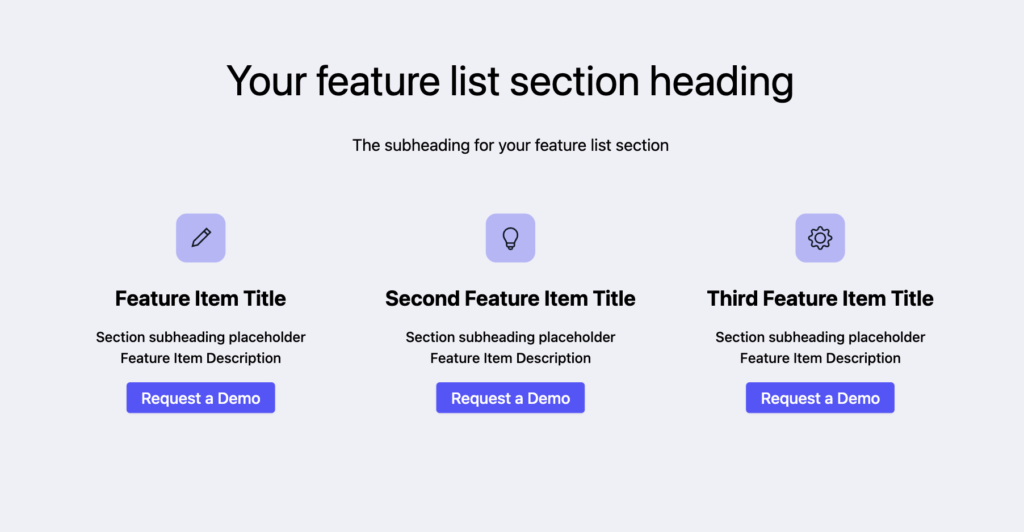
Feature List – 3 Columns
Places feature cards side-by-side, each with an icon or image, title, description, and optional CTA.
Feature List – Vertical List with Image
Stacks feature cards vertically, each containing an icon or image, title, description, and CTA. All layouts support styling controls for icons, text, and button elements.

Footer
Footer – Two Columns
A simple layout with left-aligned content and a two-column structure for navigation, links, or legal copy.

Footer – Three Columns
Expands the layout to include an additional column, useful for social icons, cookie settings, or additional product links.

Form
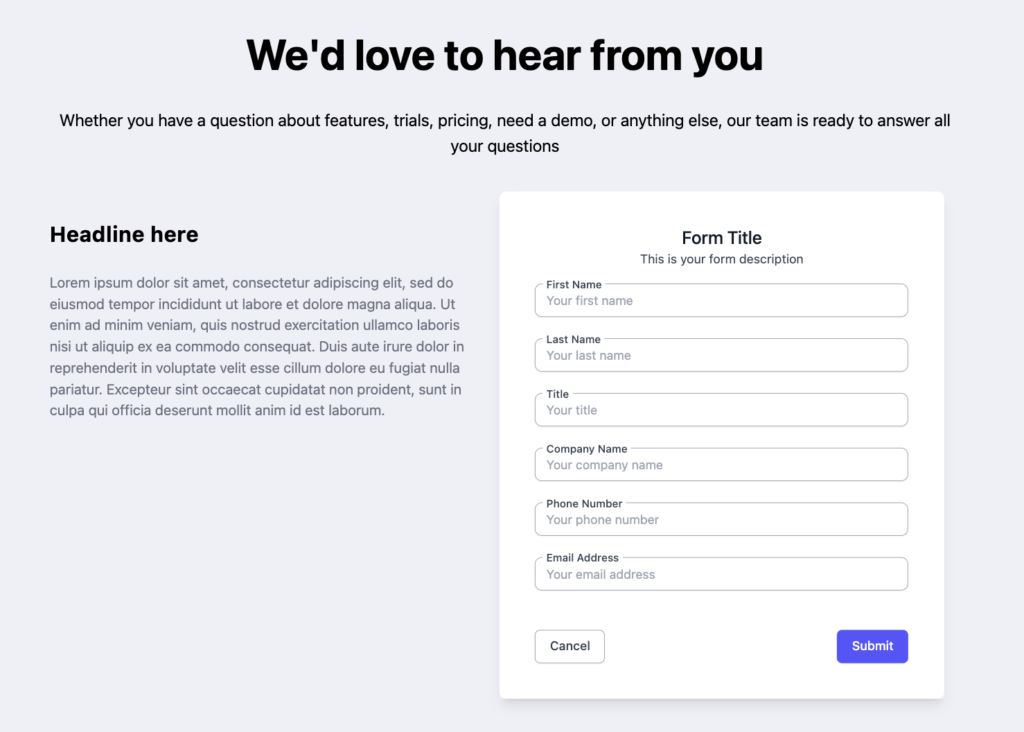
Form and Text
Displays a two-column layout. One column contains the form with a title and subheading, while the other includes editable supporting text.
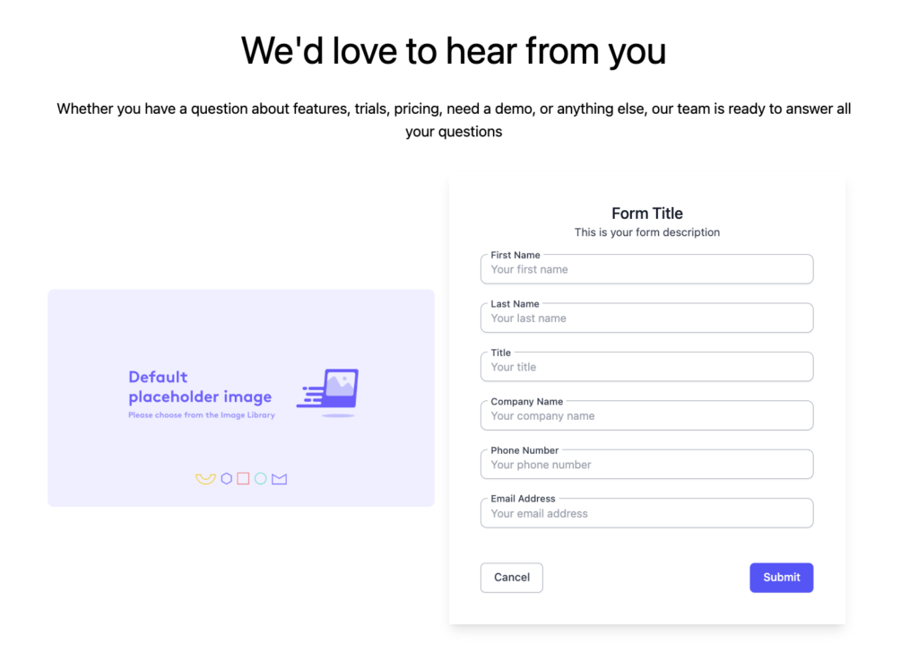
Form and Image
A similar two-column layout, except the secondary column includes a visual asset (image) rather than text.
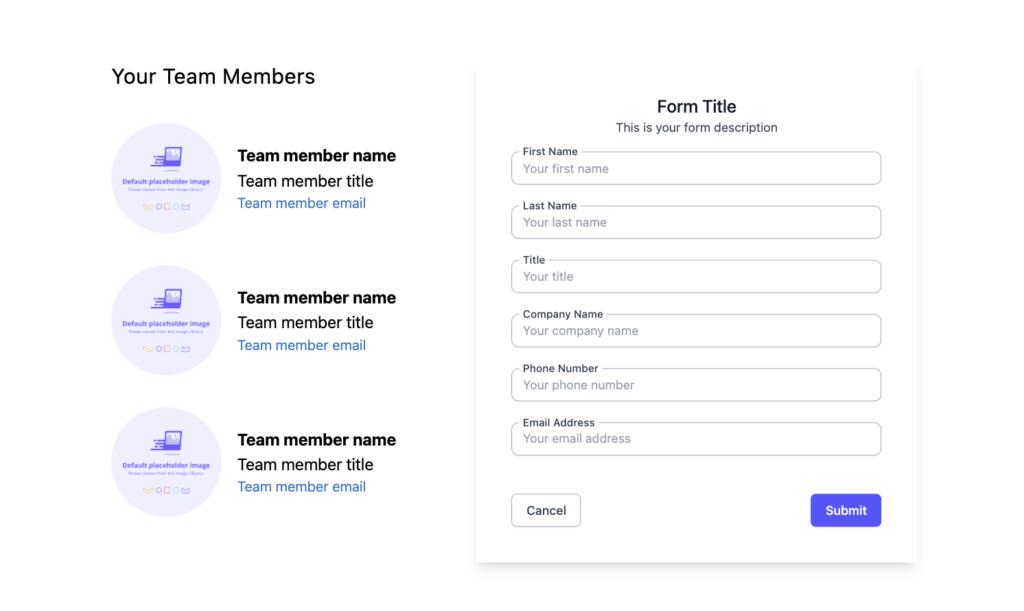
Form and Team List
Includes an embedded form alongside a list of team members. Each entry displays a headshot, name, title, and email—ideal for sales outreach or regional rep handoff.
Header
Header
Appears at the top of your Landing Page and includes your logo, navigation, and optional CTAs.

Hero
Hero-Image and CTAs
The most common hero layout, featuring a background image, heading, subheading, and one or two call-to-action buttons.
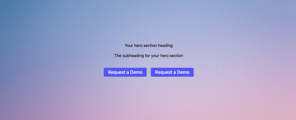
Hero with Background Image
Expands the visual presence of the hero layout by using a full-bleed background.
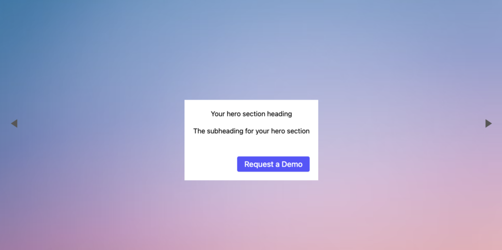
Hero with Carousel Layout
Displays rotating headline cards with optional subtext and CTAs. Timing and image options are fully configurable.
Resource Center
Resource Center
Aggregates a large collection of content assets such as eBooks, whitepapers, videos, or case studies. It supports multiple layout configurations and advanced filtering, with more detail coming soon.
Team
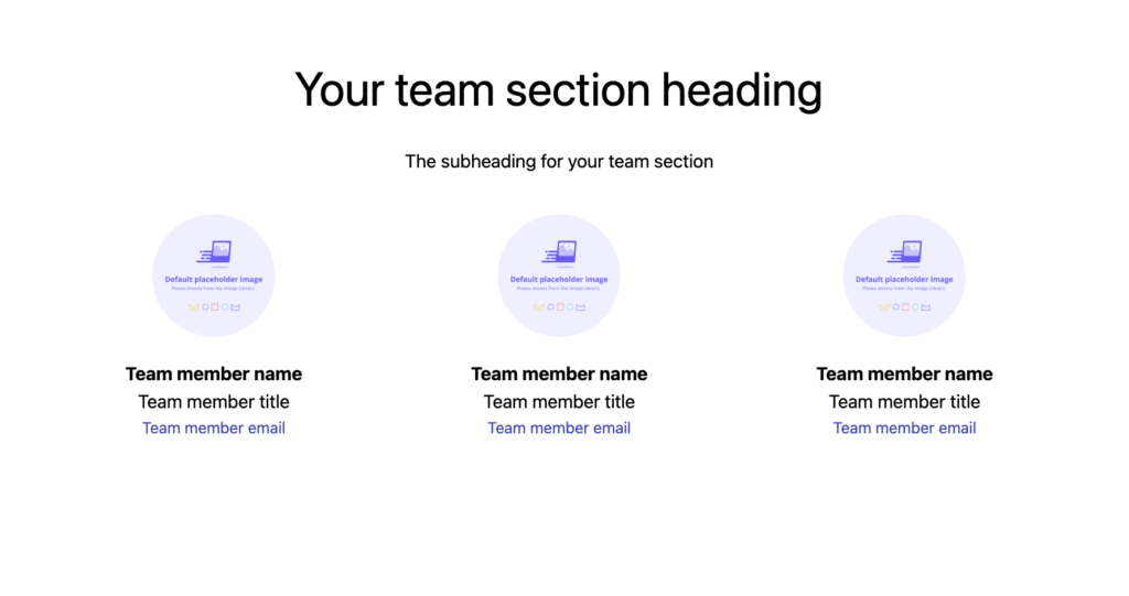
Team Members – 3 Columns
Displays up to twelve team members in a clean grid. Each profile includes an image, name, title, and email address.
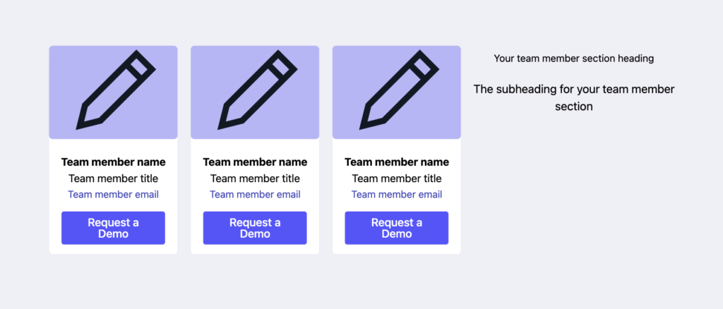
Team – Cards
Features a more compact layout with vertical cards and CTA buttons below each member.
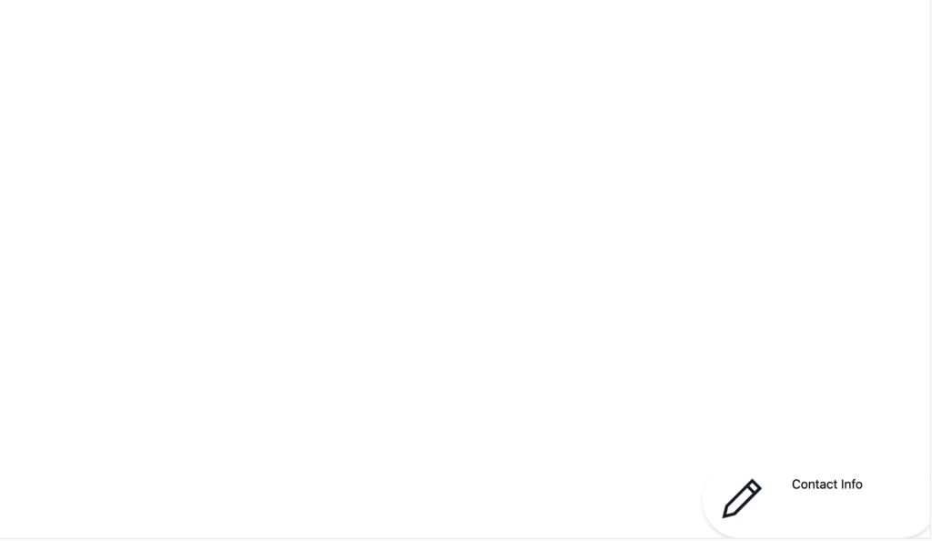
Fixed Contact Card
A floating block that stays pinned to the bottom of the page as the visitor scrolls. Ideal for adding a dedicated rep or sales contact CTA.
Testimonial
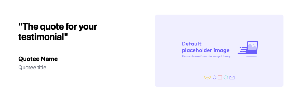
Testimonial – Image
A static testimonial layout with space for a quote, customer image, name, and title.
Testimonial – With Carousel Layout
Rotates multiple quotes in a horizontal carousel, optionally including images and CTAs.

Text
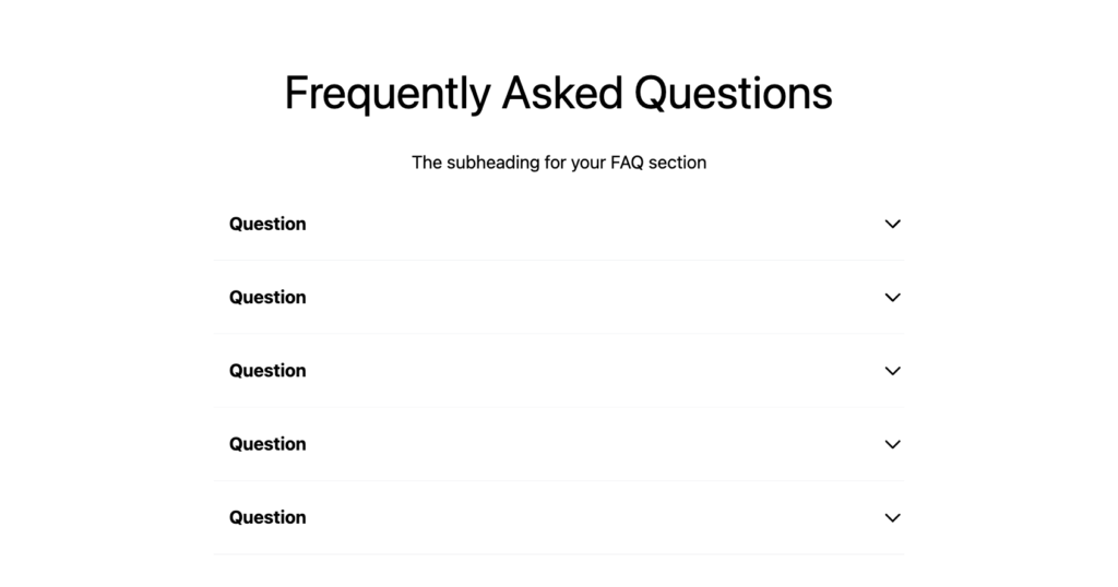
Expandable FAQs
Allows you to add a list of frequently asked questions that can expand and collapse for cleaner presentation.
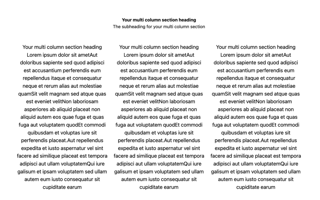
Customizable Columns (also referred to as Multi-Column Layout)
Create a section with up to three configurable columns. Each column can include text, image, video, or an embedded form. Column widths can be set as 1:1, 1:2, 2:1, or 1:2:1 ratios depending on your layout needs.
✅ Next Steps
Once you’ve configured your Theme and selected the right section layouts, you’re ready to start building your Templated Experience. Learn more by visiting the Introduction to Templated Experiences article.
Views: 146