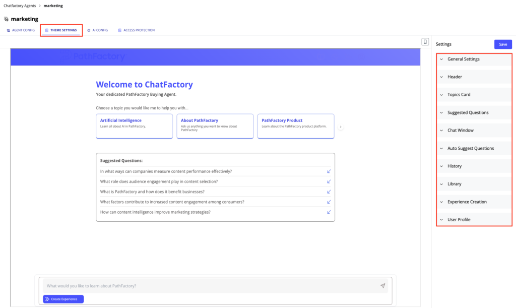
You can customize the appearance of an Agent in the Theme Settings tab. These settings ensure the Agent aligns with your organization’s branding, user preferences, and compliance requirements. The preview on the left display the changes as you make them. To view the impact of changes in mobile mode, click on the mobile icon on the top right area of the preview.
Customize the colors, logos, fonts and behaviors using the available editing menus (highlighted in the Theme Settings image below) to ensure consistency with your brand identity at a granular level.
General Settings
The “General Settings” section controls the core features and visual elements of the agent. Here, you can configure how your ChatFactory agent is put together by turning on/off certain features and setting the default color and font scheme for your agent. The configuration options include the following:
Feature Toggles
The “Feature Toggles” section provides a series of switches to enable or disable various agent features. These toggles control the availability of functionalities such as cookie consent, questions, topics, history, the library, profiles, help, and the footer.
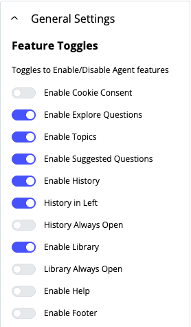
- Enable Cookie Consent: This toggle allows you to enable or disable the features of cookie management function for an agent.
- Enable Explore Questions: This toggle enables or disables the “Discover Questions” feature, which suggests relevant questions to buyers. This toggle should be turned on if you want to use the topics based UI for first-time users. There are two ways to surface the questions to buyers.
- Enable Topics: This toggle enables or disables the display of topic cards to help buyers navigate the agent through categories that are managed by the marketer. These topics can be AI-generated or they can be custom-configured by the marketer.
- Enable Suggested Questions: This toggle enables or disables the display of suggested questions to help first-time buyers get started.
- Enable History: This toggle enables or disables the display of previous questions posed by the buyer. There are two options when this toggle is turned on:
- History Always Open: This toggle controls whether the History pane is always displayed or if it can be collapsed by the buyer.
- History in Left: This toggle displays the History pane on the left hand side of the screen. By default, the history pane opens on the right.
- Enable Library: This toggle enables or disables access to content that the buyer has saved or bookmarked while interacting with the agent. Enabling this toggle also presents the following option:
- Library Always Open: This toggle controls whether the Library pane is always displayed or if it can be collapsed by the buyer.
- Enable Help: This toggle enables or disables the Help pane within the agent.
- Enable Footer: This toggle enables or disables the display of the agent’s footer.
Public Metadata
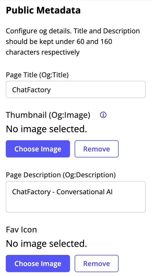
You can configure how your agent appears when referenced in Social Media. This section allows you to specific OpenGraph attributes, allowing you to control exactly how references to the agent will look.
- Page Title: Specify the title to be used for references to the agent.
- Thumbnail: Specify the thumbnail to be used for references to the agent.
- Page Description: Specify the description to be used for references to the agent.
- Fav Icon: Upload or remove a Favicon, which is a small icon associated with your agent when it is displayed on the tab on a web page. Use the “Choose Image” button to upload your icon. Use the “Remove” button to remove the current icon.
Color Scheme & Images
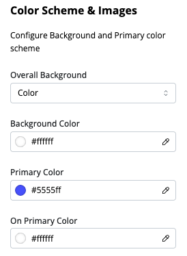
The “Color Scheme & Images” section allows you to configure the visual branding of the agent. You can customize the background, the background color scheme, the primary color scheme and the Favicon. These settings apply across all components in the agent, unless overridden by the marketer.
- Primary Color: This setting allows you to choose the primary color for the text in the agent, using a color picker or a color code (e.g., #A09898).
- Overall Background: This setting is used to set the background for the agent. Details on the options available can be found in ChatFactory Common Settings.
- Primary Color: This setting allows you to choose the primary color for the text in the agent, using a color picker or a color code (e.g., #A09898).
- On Primary Color: This setting controls the color of the text on hover, using a color picker or a color code. (e.g., #ffffff).

Public Metadata
Font Style
The “Font Style” section enables you to customize the font properties of headings and body text within the agent. Notably, Headings 1, 2, 3, and 4 are mapped to H1, H2, H3, and H4 respectively, which can enhance SEO performance.

Each Heading or Body can be configured with its own font scheme, as follows:
- Text Style: This dropdown menu allows you to select which heading or body level to configure (Heading 1, Heading 2, Heading 3, Heading 4, Body 1, Body 2, Body 3 or Body 4). For each style, you can configure font settings as follows:
- Desktop: These settings apply to the font when displayed on desktop devices.
- Font Size: Use the “+” and “-” buttons or enter a value to adjust the font size (e.g., 42pt).
- Font Weight: Enter the font weight from the dropdown menu (e.g., bold). Examples include normal, bold, lighter, bolder, 100, 400, and 900.
- Line Height: Enter a value to specify the line height (e.g., 1.5, 3em, 150%, 32px).
- Font Family: Choose a font family from the dropdown menu (e.g., inherit, Roboto, Arial).
- Mobile: These settings mirror the desktop settings and allow for separate font configurations for mobile devices.
- Desktop: These settings apply to the font when displayed on desktop devices.
Cookie Consent
This section allows you to customize the cookie consent settings for the ChatFactory agent, ensuring compliance with privacy regulations. This is only needed if you want to enforce an explicit tracking consent, using an external cookie manager, to use an agent or use ChatFactory to manage your cookies. If you manage cookies at the organization level and do not require an explicit tracking consent for using an agent , you may not need to enable this section. For details on how ChatFactory cookie consent works, see Understanding ChatFactory Cookie Consent.

- Enable External Cookie Manager: This toggle lets you choose an external cookie consent manager tool to capture the explicit tracking consent using the new ChatFactory specific cookie.
- Enable Internal Cookie Manager: Alternatively, this toggle switch enables the use of the built-in cookie management features.
- Background: Background: This setting lets you select the type of background you want for the cookie consent area that is first displayed when the user accesses the agent. You can choose between Color, Gradient and Image. Each option has its own settings, as described in ChatFactory Common Settings.
- App Logo: This setting enables you to display your organization’s logo in the cookie consent area. You can choose Change Image to select a new image to replace the existing logo, or Remove to remove the logo from the header.
- Cookie Declined Notification: This section allows you to customize the message displayed to users when they first access the ChatFactory agent. You can use the text editor to write and format the text, as described in ChatFactory Common Settings.
- Decline Action Text Color: This setting defines the color of the text used for the “decline” action within the cookie consent banner, using a color picker or a color code (e.g., #A09898).
- Cookie Consent Invoke Code: This section displays code that is used to invoke or trigger the cookie consent functionality.
Header Configuration
The Header section allows you to customize the header of your buyer agent, controlling its appearance and branding elements. You can add your organization’s logo, name and any calls to action you want to provide to your buyers. The available settings are:

Background: This setting lets you select the type of background you want for the header. You can choose between Color, Gradient and Image. Each option has its own settings, as described in ChatFactory Common Settings.
Icon Color: This setting determines the color of the icons that appear within the header (e.g., Library icon, Help icon). You can specify the color using a hexadecimal code or a color picker.
App Logo: This setting enables you to display your organization’s logo in the header. You can choose Change Image to select a new image to replace the existing logo, or Remove to remove the logo from the header.
Logo Text: This option allows you to add and format text alongside the logo. You can use the text editor to write and format the text, as described in ChatFactory Common Settings.
Enable Primary CTA: This toggle allows you to display a primary call-to-action button in the header. A call-to-action encourages users to take a specific action (e.g., “Sign Up” or “Contact Us”). Toggling this on displays a number of options to customize the CTA. These options are described in more detail in ChatFactory Common Settings.
Enable CTA in Header (Mobile): You can force the display of the primary CTA button in a header when viewing in a mobile device by enabling this toggle. If enabled, the CTA button will be part of the header instead of being displayed in the menu in mobile mode.
Enable Secondary CTA: This toggle switch allows you to display a secondary call-to-action button in the header. This button typically promotes a less important action than the primary CTA. Toggling this on displays the same options available for customizing the primary CTA.
Topics Card
This section allows you to customize the appearance and content settings of the topic cards. Topic cards are groupings of suggested questions that help users start interacting with the AI agent. For more information on how topic cards are used, see Using the ChatFactory Agent.
Configuring the appearance of topic cards
The appearance of topic cards can be configured as follows:

- Show Topic Cards: This toggle enables the display of the AI generated topic cards. The topics in this case will match the tags used in the Content Library. Only topics that have a sufficient number of documents and questions will be shown.
- Background: This setting lets you select the type of background you want for the topic cards. You can choose between Color, Gradient and Image. Each option has its own settings, as described in ChatFactory Common Settings.
- Carousel Cards Title Color: This setting allows you to set the color of the title text for the carousel of topic cards, using a color picker or a color code (e.g., #A09898).
- Carousel Cards Title: This field allows you to customize the main title text displayed above the carousel of topic cards.
- Card Title Color: This setting defines the color of the text displayed on each individual topic card and can be configured using a color picker or a color code (e.g., #A09898).
- Card Description Color: This setting determines the color of the description text displayed on each individual topic card and can be configured using a color picker or a color code (e.g., #A09898).
- Border Color: This setting defines the color of the border surrounding the topic cards and and can be configured using a color picker or a color code (e.g., #8195F2).
- Border Top: This field sets the thickness (in pixels) of the border at the top of the topic cards.
- Border Right: This field sets the thickness (in pixels) of the border on the right side of the topic cards.
- Border Left: This field sets the thickness (in pixels) of the border on the left side of the topic cards.
- Border Bottom: This field sets the thickness (in pixels) of the border at the bottom of the topic cards.
Configuring questions and custom topics
You can choose multiple options for selecting the actual topics and the questions for each topic. To determine the best approach, it is helpful to understand how topics are created.
PathFactory’s AI uses the organization’s tags to create the topics. When an organization creates tags under the Topics category and allows that category to use AI for tagging, PathFactory’s AI automatically tags assets in the Content Library with those tags, and generates possible questions for each asset. If you are happy with the topics and questions initially presented by the AI, you need to take no further action. If you wish to modify the topics, click on the Modify Topics button. This opens an interface that allows you to customize the topics and questions that the AI suggests to users as starting points for their interactions. You can also change the order of the topics by dragging and dropping them appropriately.
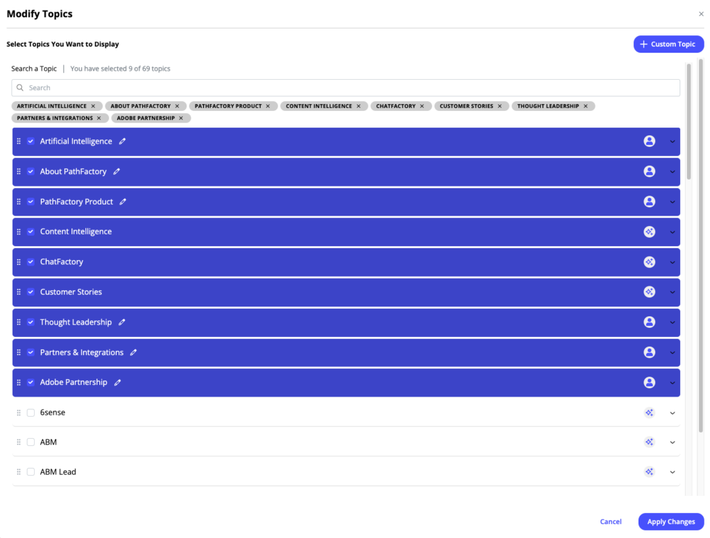
Options in this interface include:
-
- Choose or search for a Topic: Clicking the checkbox on each topic selects it for display. The topic can be removed by clicking on the “x” icon for that topic in the selected topics list below the search bar.
- Questions Related to the Topic: Each topic can be opened to expose other configurable parameters. These include:
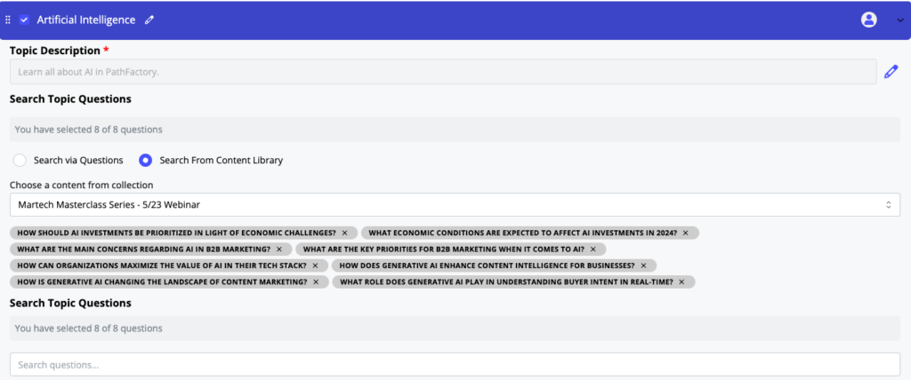
Topic Questions -
- Topic Description: Add a description for that topic here.
- Search Topic Questions: This area allows you to search for specific questions or search a specific document in the content library for questions. These options give you the flexibility to bias questions towards specific documents or towards specific areas. Either option displays a set of questions that you can choose from to include under that topic.
-
-
- Custom Topics: If you want to configure and manage one or more topics instead of having the AI do it for you, you can do so by clicking on the Custom Topic button. These topics can be in addition to any AI topics you choose to use – you have the option to mix and match the two. This will take you to a window where you can:
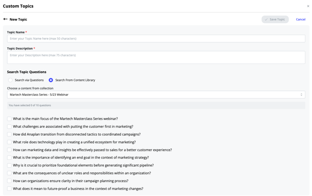
Custom Topics - Topic Name: Enter a name for the topic in the provided field.
- Topic Description: Enter or edit a description of the selected topic. This description will be displayed to users when they view the Topics card in the agent interface.
- Search Topic Questions: This area allows you to search for specific questions or search a specific document in the content library for questions. These options give you the flexibility to bias questions towards specific documents or towards specific areas. Either option displays a set of questions that you can choose from to include under that topic.
- Custom Topics: If you want to configure and manage one or more topics instead of having the AI do it for you, you can do so by clicking on the Custom Topic button. These topics can be in addition to any AI topics you choose to use – you have the option to mix and match the two. This will take you to a window where you can:
Suggested Questions
The Suggested Questions feature displays a list of questions in the main page of the ChatFactory agent. These questions are a great way for first time users to quickly get started with the ChatFactory agent. PathFactory’s AI surfaces these questions from the most engaged content, so it is likely that new users will find these questions useful and pertinent.
This section allows you to customize the appearance of the suggested questions area, as well as the questions that appear there. Note that the questions that are selected by you will typically show up for first-time users only. As a user engages further with the agent and with other PathFactory content, PathFactory’s AI will personalize these questions to reflect that user’s interests.
The following are the settings you can configure:
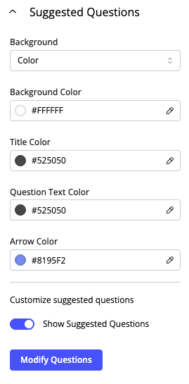
- Show Suggested Questions: This toggle enables the display of the Suggested Questions in the UI.
- Background: This setting lets you select the type of background you want for the header. You can choose between Color, Gradient and Image. Each option has its own settings, as described in ChatFactory Common Settings.
- Title Color: This setting defines the color of the title of the Suggested Questions area, and can be configured using a color picker or a color code (e.g., #A09898).
- Question Text Color: This setting defines the color of the text for the suggested questions themselves, and can be configured using a color picker or a color code (e.g., #A09898).
- Arrow Color: This setting determines the color of the arrow icons in the Suggested Questions area, and can be configured using a color picker or a color code (e.g., #A09898).
- Modify Questions: This setting allows you to modify the suggested questions that are displayed to first time users. You can use the search bar to find questions in areas of interest, and reorder or remove the questions that are added in this interface.
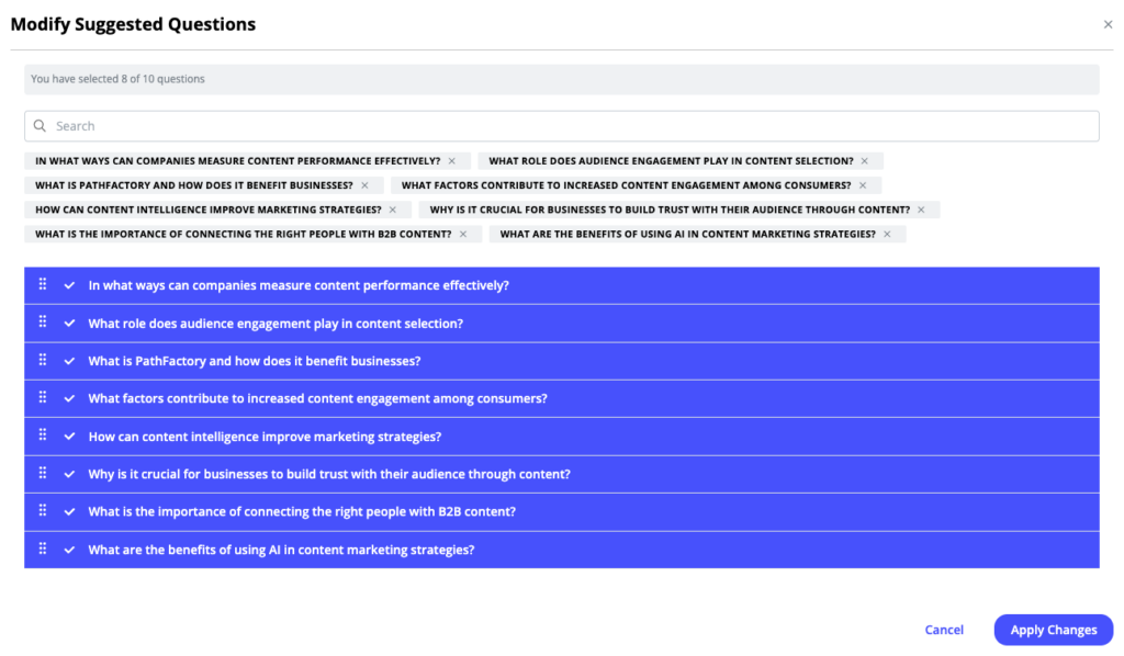
Modify Suggested Questions
Chat Window
The Chat Window is the main area of interaction between the user and the agent. It is where users enter their queries to the agent, view responses and recommendations, reformat responses, bookmark assets and launch the experience creation process. This section allows you to customize the appearance and initial message of the chat window.

- Background: This setting lets you select the type of background you want for the header. You can choose between Color, Gradient and Image. Each option has its own settings, as described in ChatFactory Common Settings.
- Empty State Message: This text editor customizes the initial greeting message displayed to the user before they begin a conversation with the AI agent. It is used when the Topics option is turned off. Details about using the text editor can be found in ChatFactory Common Settings.
- User Icon: This setting allows you to customize the icon that represents the user in the chat interface. The Change Image button allows you to upload a new image file to replace the current icon, while the Remove button deletes the current user icon.
- Bot Icon: This setting allows you to customize the icon that represents the AI agent in the chat interface. The Change Image button allows you to upload a new image file to replace the current icon, while the Remove button deletes the current user icon.
- Name the Bot: Customers often want to give the bot a name to make it more personable and relatable. This field allows you to specify the name that is displayed for the AI agent in the chat interface.
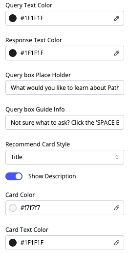
- Query Text Color: This setting defines the color of the text that the user types in the chat input box and can be configured using a color picker or a color code (e.g., #333333).
- Response Text Color: This setting defines the color of the text that the AI agent displays in its responses and can be configured using a color picker or a color code (e.g., #6c4f8c).
- Query box Place Holder: This field sets the placeholder text that appears in the chat input box before the user starts typing. It can be configured to provide a hint or example of what the user can type.
- Query box Guide Info: This field provides additional guidance or instructions related to the chat input box, such as suggesting specific actions or providing tips to the user.
- Recommend Card Style: This dropdown menu allows you to choose the style or layout of the cards used to display recommended content. The options are Title or Thumbnail. If Title is selected, a Show Description toggle controls whether a description of the recommended content is shown on the card. You can also configure the background Card Color, as well as the Card Text Color.
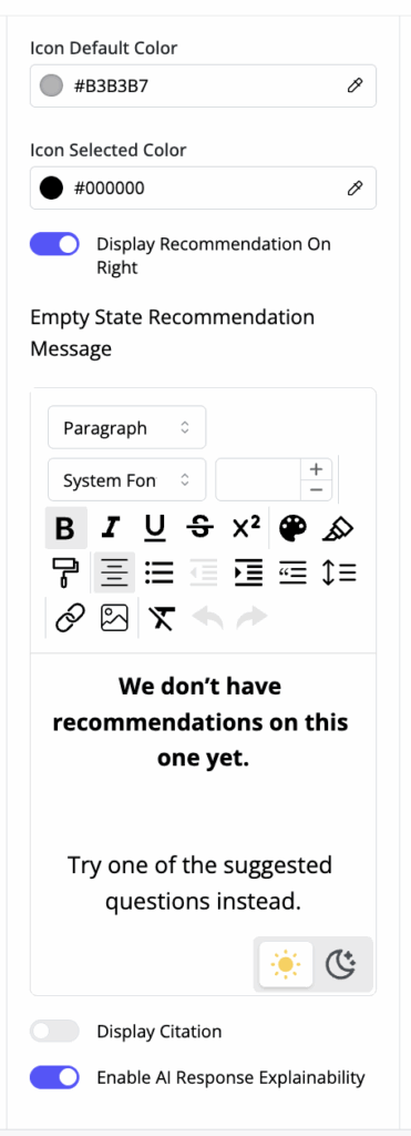
Chat Window Configuration – Icons, Recommendation Message and Display Toggles
- Icon Default Color: This setting defines the default color of any icons that appear on the header, and can be configured using a color picker or a color code (e.g., #9b6dc1).
- Icon Selected Color: This setting defines the color of icons when they are selected or active and can be configured using a color picker or a color code (e.g., #7d7373).
- Display Recommendation On Right: This toggle controls whether the recommendation cards are displayed on the right side of the chat interface. Otherwise, recommendations are displayed at the bottom of the response.
- Empty State Recommendation Message: This text editor customizes the message displayed when there are no recommendations to show to the user. Details about using the text editor can be found in ChatFactory Common Settings.
- Display Experience Button: This toggle controls whether the “Create Experience” / “Update Experience” button is displayed in the chat window. This button is used by the user to launch the experience creation process.
- Display Citation: This toggle controls whether citations or sources are displayed along with the AI agent’s responses. This is important for transparency and allowing users to verify information.
- Enable AI Response Explainability: This toggle controls the behavior of the display when a response is being created to a question. Toggling it on displays the steps the AI is going through to come up with the response, while toggling it off shows a simple wait icon. When toggled on, the display shows the specific stage the AI is in, and updates as the stage changes. Note that it is normal for the AI to go back to a previous step for further processing in order to get a better answer – so users may see steps repeating during this process.
Auto Suggest Questions
Auto Suggest Questions are type-ahead style questions that appear as the user types in their query, and help users formulate their queries and discover relevant topics. This section allows you to customize the appearance of these questions.
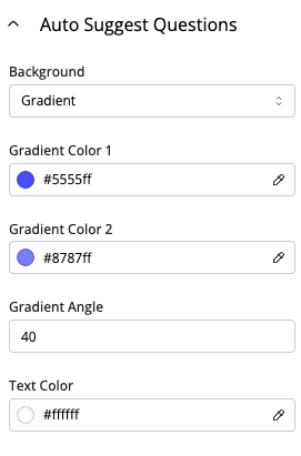
- Background: This setting lets you select the type of background you want for the auto-suggest questions area. You can choose between Color, Gradient and Image. Each option has its own settings, as described in ChatFactory Common Settings.
- Text Color: This setting defines the color of the text for the auto-suggested questions, and can be configured using a color picker or a color code (e.g., #99068a).
History
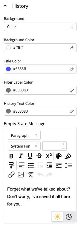
The History pane shows all the questions that the user has asked the agent, grouped by date. Users find it useful to sometimes revisit past questions and to continue conversation threads from past visits. This section allows you to customize the appearance of the History pane.
-
- Background: This setting lets you select the type of background you want for the auto-suggest questions area. You can choose between Color, Gradient and Image. Each option has its own settings, as described in ChatFactory Common Settings.
- Title Text Color: This setting defines the color of the title and help text in the history pane, and can be configured using a color picker or a color code (e.g., #a09898).
- Filter Label Color: This setting defines the color of the text used for the filter labels within the history pane, which group the questions by date ranges, and can be configured using a color picker or a color code (e.g., #a09898).
- History Text Color: This setting defines the color of the text used to display the actual question history (the user’s questions), and can be configured using a color picker or a color code (e.g., #a09898).
- Empty State Message: This text editor customizes the message displayed in the history pane when the user has not yet had any conversations with the AI agent. Details about using the text editor can be found in ChatFactory Common Settings.
Library
The Library Pane lists all the content that the user has bookmarked while interacting with the ChatFactory agent. The content saved here can be reviewed later or added to a personalized landing page that the user can create. This section allows you to customize the appearance and messages of the library pane.
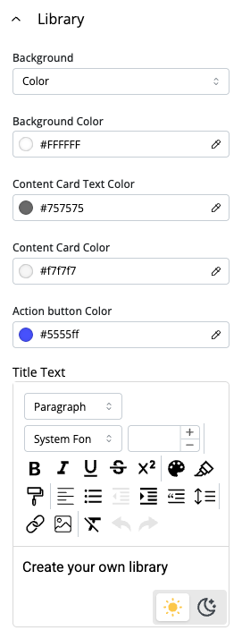
- Background: This setting lets you select the type of background you want for the Library pane. You can choose between Color, Gradient and Image. Each option has its own settings, as described in ChatFactory Common Settings.
- Content Card Text Color: This setting allows you to set the color of the bookmarked content title and description, using a color picker or a color code (e.g., #A09898).
- Carousel Cards Title: This field allows you to customize the main title text displayed above the carousel of topic cards.
- Content Card Color: This setting defines the color of the bookmarked content card, and can be configured using a color picker or a color code (e.g., #A09898).
- Action button Color: This setting defines the background color of the main action button within the library pane. This button is used to create or update the personalized landing page for the buyer.
- Title Text: This text editor customizes the title of the library pane. Details about using the text editor can be found in ChatFactory Common Settings.

- Help Info: This text editor customizes the helper message displayed within the library pane. Details about using the text editor can be found in ChatFactory Common Settings.
- Empty State Message: This text editor customizes the message displayed when the user has not yet added any content to their library. Details about using the text editor can be found in ChatFactory Common Settings.
- Action Button Text: This field allows you to customize the text that appears on the main action button within the library pane.
Experience Creation
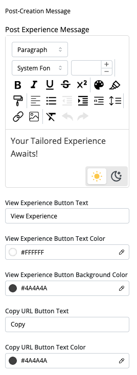
This section allows you to customize the appearance of the interface where users create their personalized landing pages, or Experiences. The user can explicity create these experiences, or they can be automatically created and sent to the user at the end of a session. The experiences contain a summary of the users conversation with the agent, as well as content that they bookmarked in the agent library. Marketers control the other “non-configurable” sections of the experience, and add their own messaging, hero sections and other information that they want to provide, which is then included with the personalized summary and recommended content. Note that if marketers change the underlying landing pages to update the non-configurable sections, the experiences automatically update to reflect any changes, ensuring that the user is seeing the most updated information from the marketer.
The following can be configured:

- Background: This setting lets you select the type of background you want for the experience generation message screen. You can choose between Color, Gradient and Image. Each option has its own settings, as described in ChatFactory Common Settings.
- Logo: This setting enables you to display your organization’s logo in the message screen. You can choose to Change Image and select a new image to replace the existing logo, or Remove removing the logo from the header.
- Prompt Background Color:
- Icon Color: This setting determines the color of the icons that appear within the header (e.g., Library icon, Help icon). You can specify the color using a hexadecimal code or a color picker.
- Promo Message: There are three promo messages that can be shown during the experience creation process. This allows you to provide additional marketing information to the buyer while they wait for the experience to get created. A text editor is provided for each promo message. Details about using the text editor can be found in ChatFactory Common Settings.
User Profile
This section allows you to customize the appearance of the user profile pane. This pane displays information about the user and is used when the user interacts with multiple agents. This section is visible when the user profile toggle is enabled under Access Protection tab.
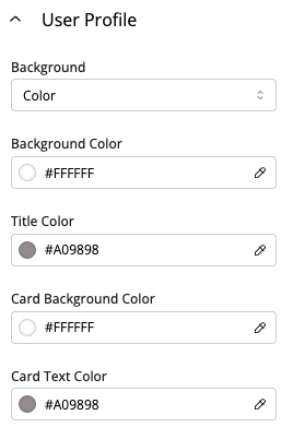
- Background: This setting lets you select the type of background you want for the User Profile pane. You can choose between Color, Gradient and Image. Each option has its own settings, as described in ChatFactory Common Settings.
- Title Color: This setting allows you to set the color of the title text using a color picker or a color code (e.g., #A09898).
- Card Background Color: This setting allows you to set the background color of the profile card using a color picker or a color code (e.g., #A09898).
- Card Text Color: This setting allows you to set the color of the text in the card using a color picker or a color code (e.g., #A09898).
Help
This section allows you to customize the Help area of your buyer agent. Help can be used by buyers to get a preliminary understanding of the buyer agent. It even gives you the option to add a Getting Started video, along with textual content. The available settings are:
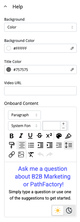
- Background: This setting lets you select the type of background you want for the foot. You can choose between Color, Gradient and Image. Each option has its own settings, as described in ChatFactory Common Settings.
- Title Color: This setting allows you to set the color of the title text using a color picker or a color code (e.g., #A09898).
- Video URL: You can provide a link to a Getting Started or other helpful video that the buyer can view. The video can include information on how to use the agent as well as any other useful information you choose to provide.
- Onboard Content: This option allows you to add and format text in the Help area. You can use the text editor to write and format the text, as described in ChatFactory Common Settings.
Footer
This section allows you to customize the footer of your buyer agent, controlling its appearance and branding elements. This is a great place to add links, disclaimers, copyrights and other text that is normally associated with footers. The available settings are:
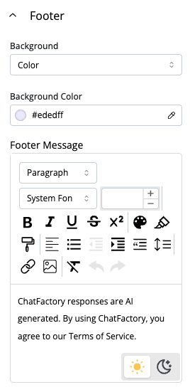
- Background: This setting lets you select the type of background you want for the foot. You can choose between Color, Gradient and Image. Each option has its own settings, as described in ChatFactory Common Settings.
- Footer Text: This option allows you to add and format text in the footer. You can use the text editor to write and format the text, as described in ChatFactory Common Settings.
Views: 214
