When configuring ChatFactory, there are frequently used attributes that are available in different configuration options. They are typically used when setting a background, a Call-To-Action (CTA) or a text editor. The following sections describe how these components can be configured.
Background
Background settings are available for all the user interfaces of PathFactory components. A typical background configuration supports three options:
- Color – This option displays a solid color as the background for the agent. With this option, you can pick the Background Color for the component, using a color picker or by entering a color code (e.g., #F3F3F3).

Background Color - Gradient – The term Gradient refers to a gradual transition between colors, where one color smoothly blends into another. It creates a visual effect where colors shift smoothly from one to another, adding depth and dimension to the background. This option allows for more intricate color transitions and visual effects. It provides greater flexibility in designing the background, allowing for a more nuanced and dynamic appearance. If you select the Gradient option, you may select:
- Up to two gradient colors (Gradient Color 1 and Gradient Color 2) that define the beginning and end of the gradient range.
- The Gradient Angle, which refers to the direction in which the gradient is applied on the background. It determines the orientation of the color transition, affecting how the colors blend and appear on the screen. Adjusting the gradient angle can create different visual effects, such as horizontal, vertical, diagonal, or radial color transitions, enhancing the overall aesthetics of the background.
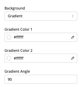
Background Gradient
- Image – This option lets you choose an image to display in the background of the section. Once you have added an image, you may also specify its Background Transparency, which is the percentage of transparency that you desire for the image to show through.
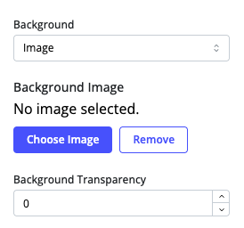
Background Image
Text Editor
The text editor is used in any place where you can configure the text that is displayed to the buyer. The editor provides a range of formatting options and tools, including:
-
- Style: A dropdown menu to select the style of the content (e.g., heading, paragraph).
- System Font: A dropdown menu to choose the font family.
- Font Format: Options to make the text Bold, Italics, Underlined, Strikethrough or Superscript.
- Text color and background color selection
- Format painter
- Text alignment
- Lists (bulleted and ordered)
- Text indentation
- Block quotes
- Text spacing
- Hyperlink insertion
- Image insertion
- Clear formatting
- Undo/Redo
- Display toggle in the text area that changes the text background in the event the text color is something that is light or dark and cannot be viewed in the text area.
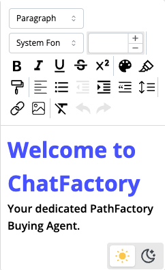
Text Editor
Call-To-Action (CTA) buttons
The CTA buttons allow marketers to provide an actionable link in the UI that allows a buyer to take a specific action like fill a form, go to a specific location on the website, send an email or other similar options. These buttons should be customized so that they follow brand guidelines and blend in with the rest of the interface. CTA buttons typically have the following configuration options:

-
- CTA ID: A unique identifier for the CTA. This is used for internal tracking or styling purposes and is not visible to the end-user.
- CTA Size: This dropdown menu controls the size of the CTA button (e.g., small, medium, large). You can select a predefined size option from the list.
- CTA Text: This field determines the text displayed on the CTA button,
- CTA Text Type: This dropdown menu lets you define the text’s style or formatting. Options include different heading and body levels, as defined in the General Settings.
- CTA Text Color Override: This color picker lets you override the default color of the CTA with your own, preferred color.
- CTA Background Color Override: The color picker lets you override the default background color and choose your preferred background color for the button.
- CTA Background Color on Hover Override: The color picker let’s you set a different background color that the CTA button will display when a user hovers their mouse cursor over it.
- CTA Type: This dropdown menu defines the type of action triggered when a user clicks the CTA button. Options are:
- Link: Navigate the user to a web address, as defined below:
- CTA URL: The web address the user is taken to upon clicking the CTA button
- Link type: Options on how the linked page is surfaced to the user, i.e. as a new tab, on the same page or as an overlay.
- Section Link: Navigate the user to a different part of the page, as defined by the Section ID, which is the ID of the section the user is taken to upon clicking on the link.
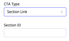
CTA Section Link - Email: Launch an email editor, as defined by the CTA Email entry.
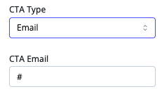
CTA Email - Form: Display a form by providing the Form ID and the Form Type. The Form Type can be the following:
- External Form: This is configured by providing the Form Source, which can either be:
- New: Provide the URL and Destination to a form from your Marketing Automation Platform (MAP), or
- Form Library, where you choose a form from your form library.
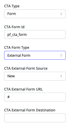
CTA Form External
- External Form: This is configured by providing the Form Source, which can either be:
- Link: Navigate the user to a web address, as defined below:
-
-
-
- Custom Form: Link to a custom form by providing the Custom Form Name and the Form Source, which can be:
-
-
-
-
-
-
- Form Component, where the form has been created as a component in the theme, or
- Form Library, where you choose a form from your form library.
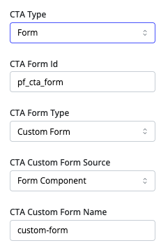
CTA Form Custom
- Standard Form: Link to the standard form by providing the Form Source, which can be:
- Form Component, giving you an option to configure the standard form, or
- Form Library, where you choose a form from your form library.
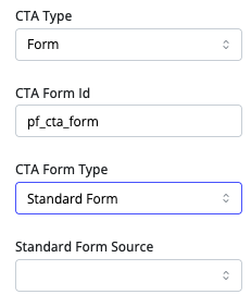
CTA Form Standard
-
-
-
Views: 115
